
PADDINGTON X BONNE MAMAN
PACKAGING - ADVERTISEMENT - ILLUSTRATION
THE BRIEF.
I was prompted to create a brand collaboration between two companies whose partnership would feel authentic. I paired Bonne Maman, a French preserve brand known for its traditional recipes, gingham packaging, and homemade charm, with Paddington, the beloved literary character famous for his fondness for marmalade. Both brands share themes of warmth, comfort, and heritage, making the collaboration feel natural and story-driven rather than purely promotional.
Project Length: 2 Months
Programs: Illustrator, Photoshop, and Procreate
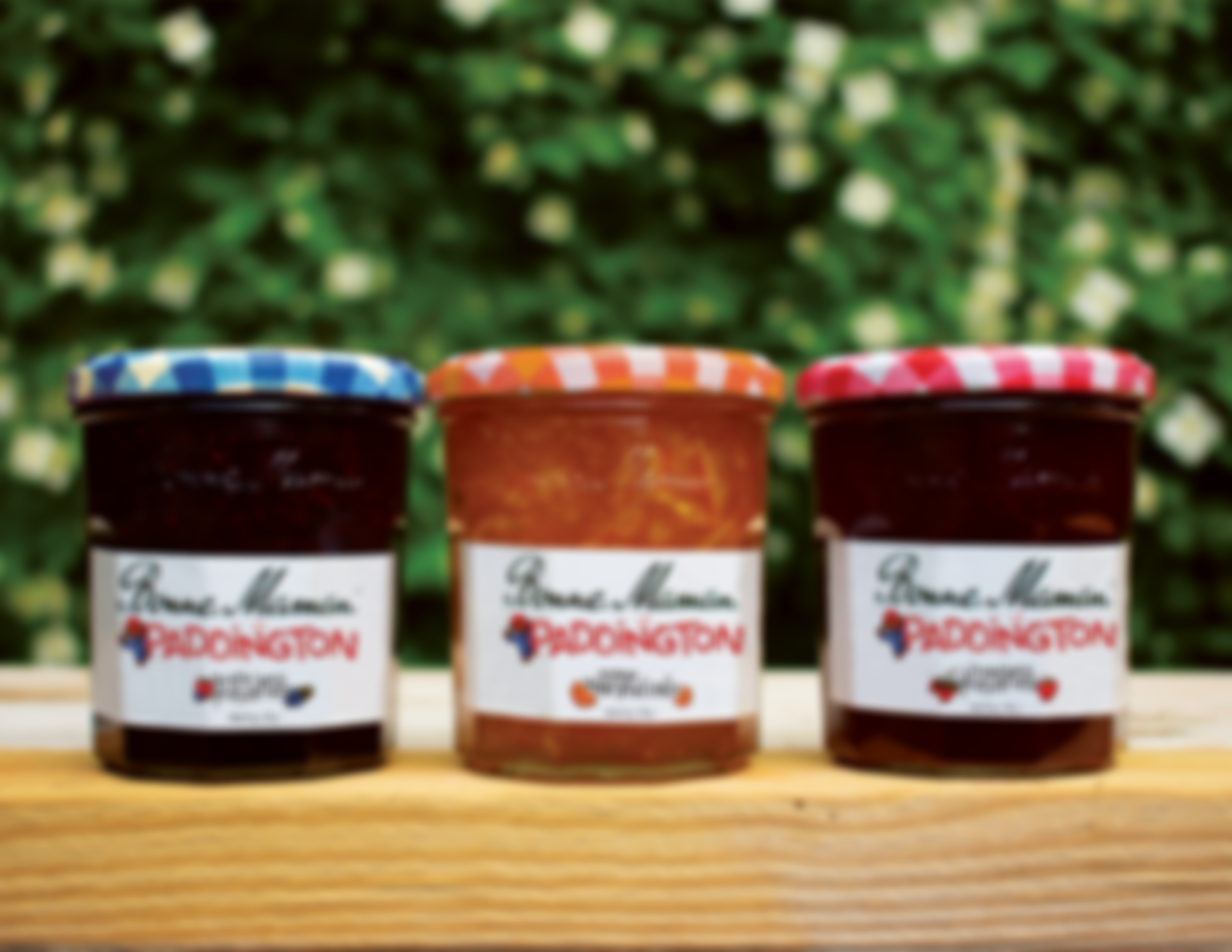
The collaboration was developed through a cohesive illustrative style designed to feel nostalgic and storybook-inspired while remaining aligned with Bonne Maman’s established visual identity. The final deliverables included limited-edition jam and marmalade jars, physical packaging for the set, with statc and motion advertisements to supplement the campaign.
The goal was to create a partnership that felt seamless, blending brand storytelling, character narrative, and product design into a unified visual system. This project allowed me to explore packaging, illustration, and campaign execution while maintaining consistency across multiple brand touchpoints
THE LOGOS.
The collaboration logo merges key visual elements from both brands to create a cohesive, balanced mark. Bonne Maman’s recognizable script and classic framing structure serve as the foundation, preserving the brand’s established identity and heritage feel.
Paddington is incorporated through illustrative detailing and character-driven elements that integrate seamlessly rather than overpower the existing mark. The result maintains Bonne Maman’s authenticity while subtly introducing Paddington’s personality, creating a logo that feels collaborative rather than co-branded as two separate entities placed side by side.
COLORS AND TYPE.
The color palette was intentionally kept warm and fruit-driven to reflect both the product and the emotional tone of the collaboration. Rich reds and soft off-whites anchor the system, referencing Bonne Maman’s established branding while reinforcing the natural, homemade quality of the jams and marmalades.
Accents of orange and blue were introduced to create contrast and visual interest, subtly nodding to Paddington’s iconic color cues. Together, the palette feels cohesive, inviting, and nostalgic, while maintaining enough vibrancy to stand out across packaging and campaign materials.
All typography was set in New Kansas, chosen for its warm, vintage character and handcrafted feel. The typeface reinforces the nostalgic, storybook tone of the collaboration while maintaining clarity and consistency across packaging and campaign materials. Its subtle personality complements the illustrative style without overwhelming it, helping unify the entire visual system.
THE MOTION.
The motion component extends the illustrative system into a simple, hand-drawn frame-by-frame animation.
Paddington briefly peeks out from behind the jam jar before ducking back out of sight, adding a moment of charm and personality to the campaign. Though minimal in movement, the animation reinforces the playful tone of the collaboration while maintaining the handcrafted aesthetic established across the packaging and static materials.
