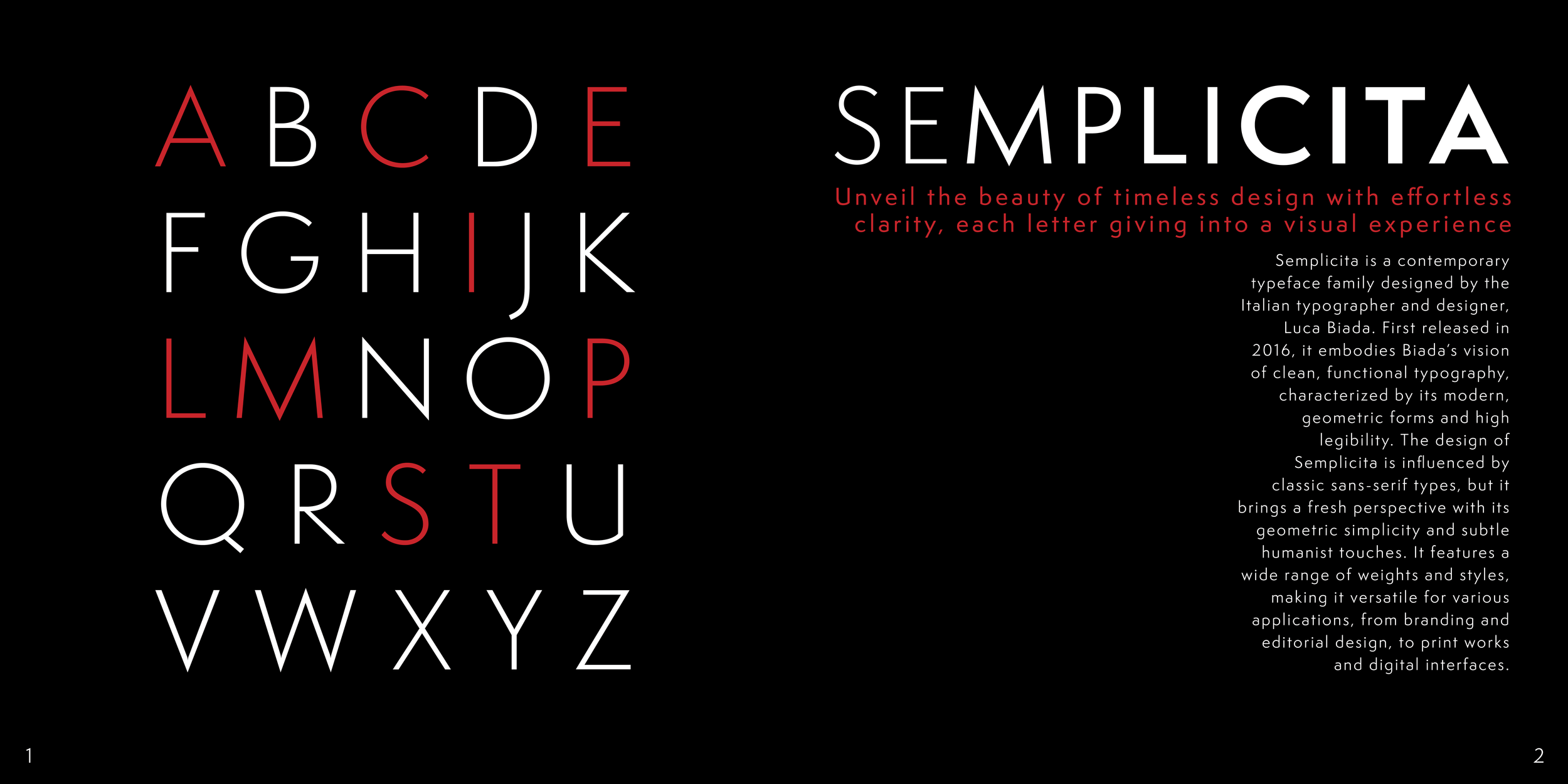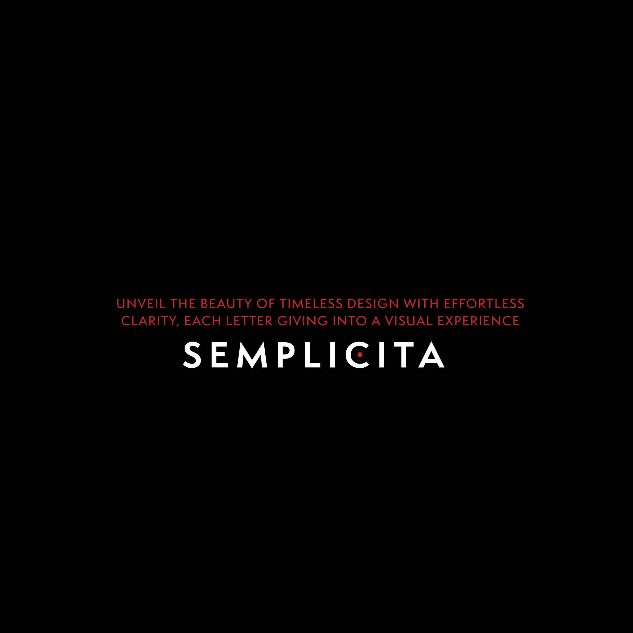
SEMPLICITA TYPE SPECIMEN
EDITORIAL - TYPOGRAPHY
THE BRIEF.
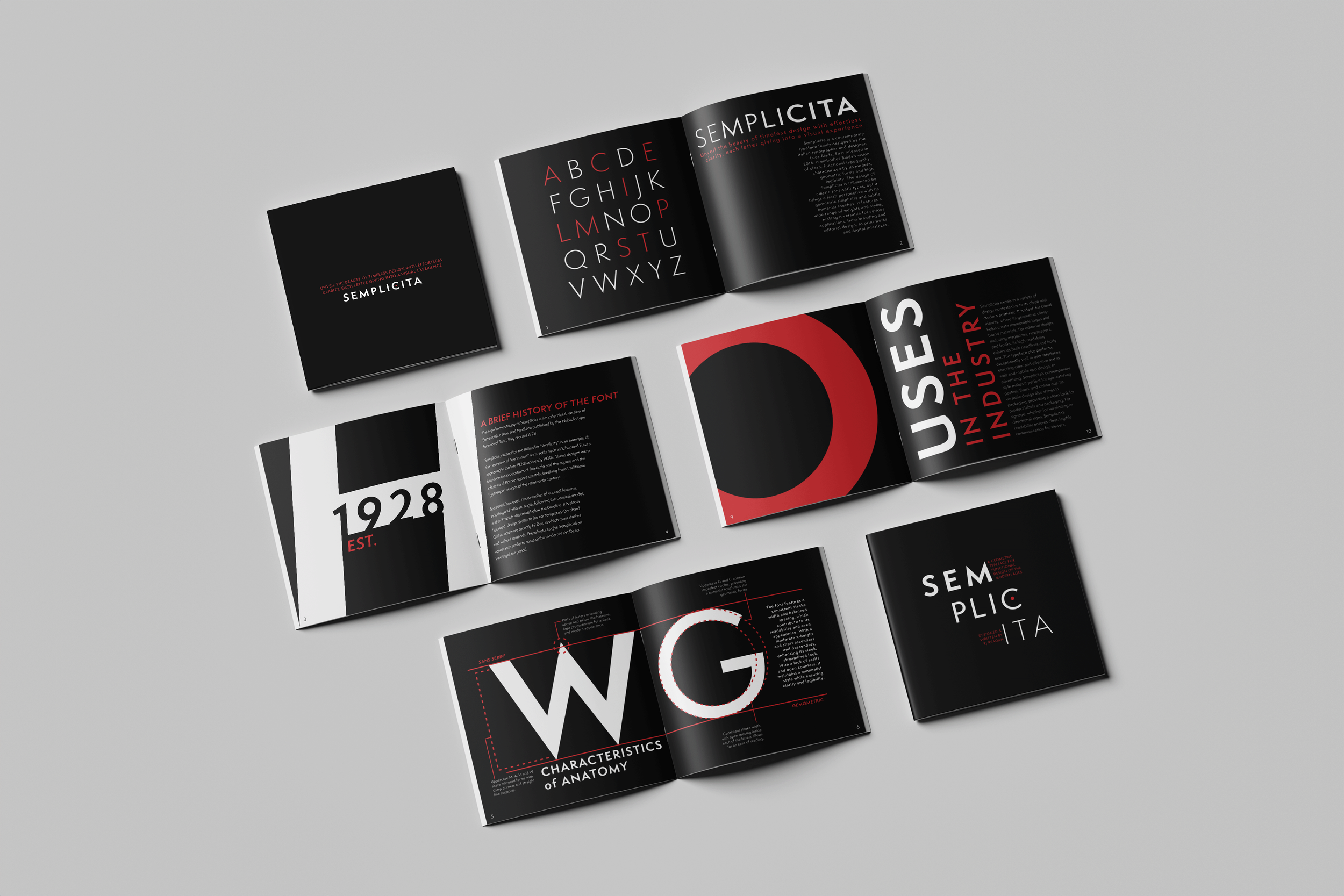
Tasked with creating a type specimen dedicated to a typeface of our choosing, I selected Semplicità as both subject and medium, allowing its voice to fully define the tone of the book. This project explores the typeface’s quiet elegance, geometric clarity, and subtle expressiveness through a series of carefully composed layouts.
The objective was to showcase its formal qualities while also educating the viewer on its features and usage. I intended to create a system that is both informative and visually engaging, allowing the typeface itself to remain the primary focus.
Project Length: 2 Months
Programs: Illustrator and InDesign
THE TYPEFACE.
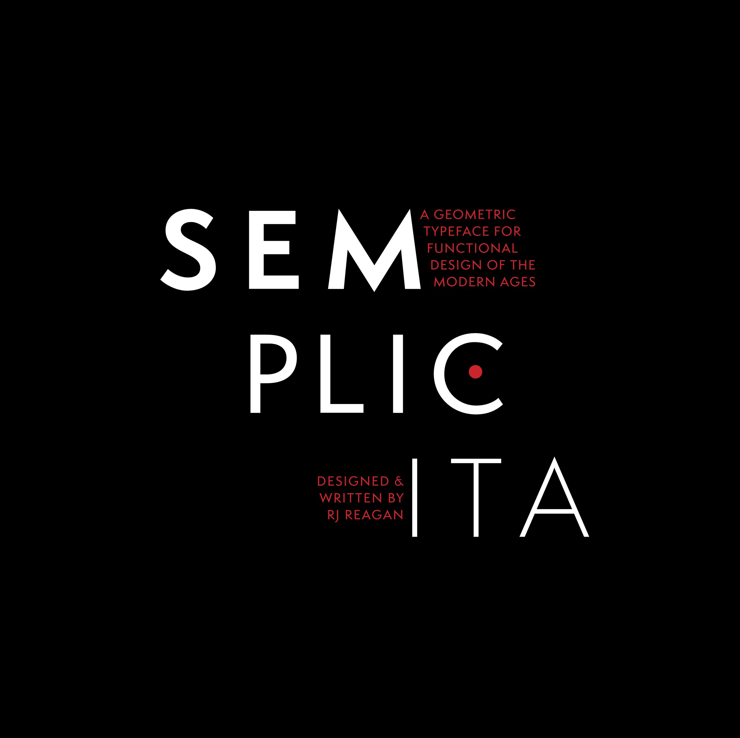
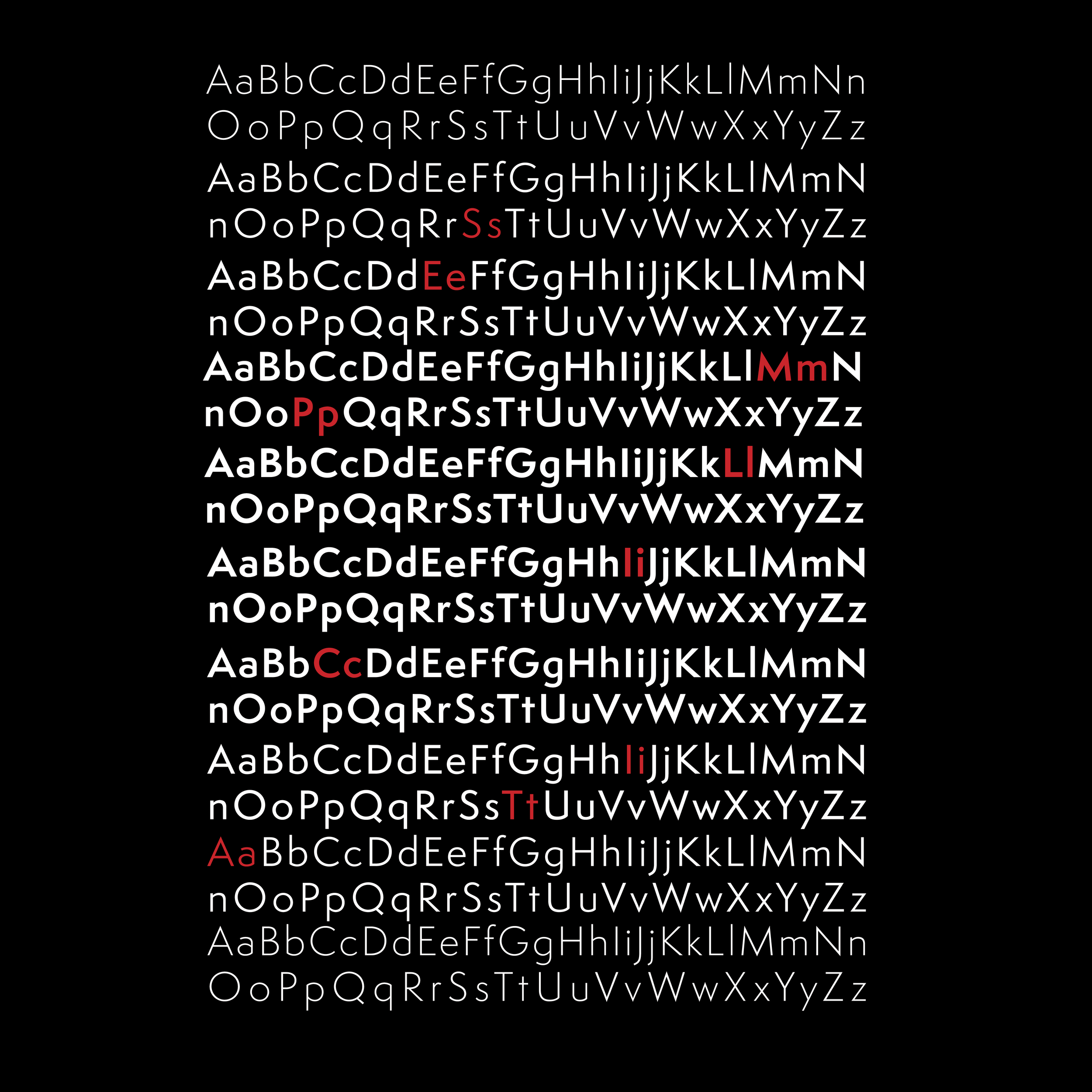
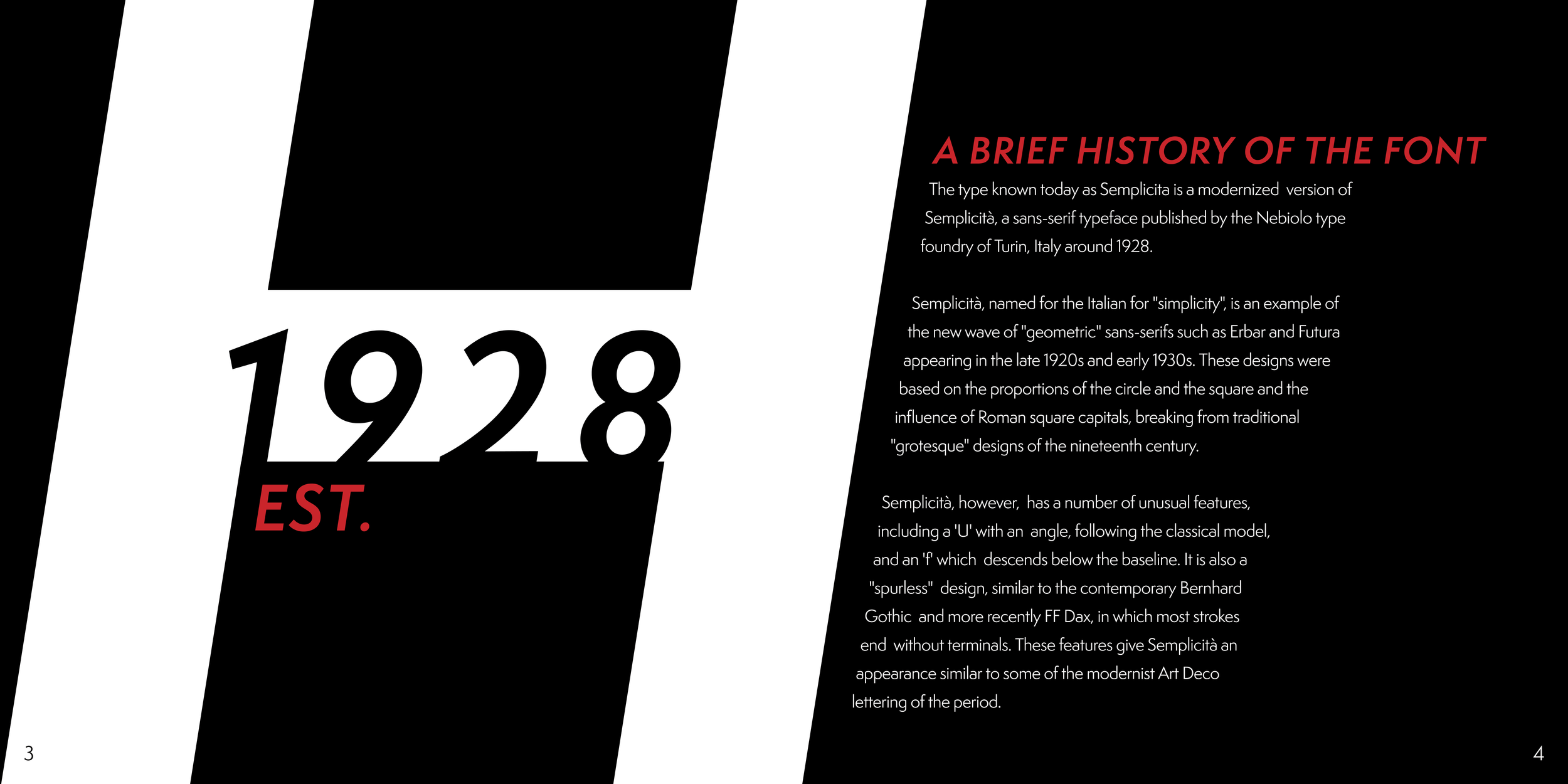
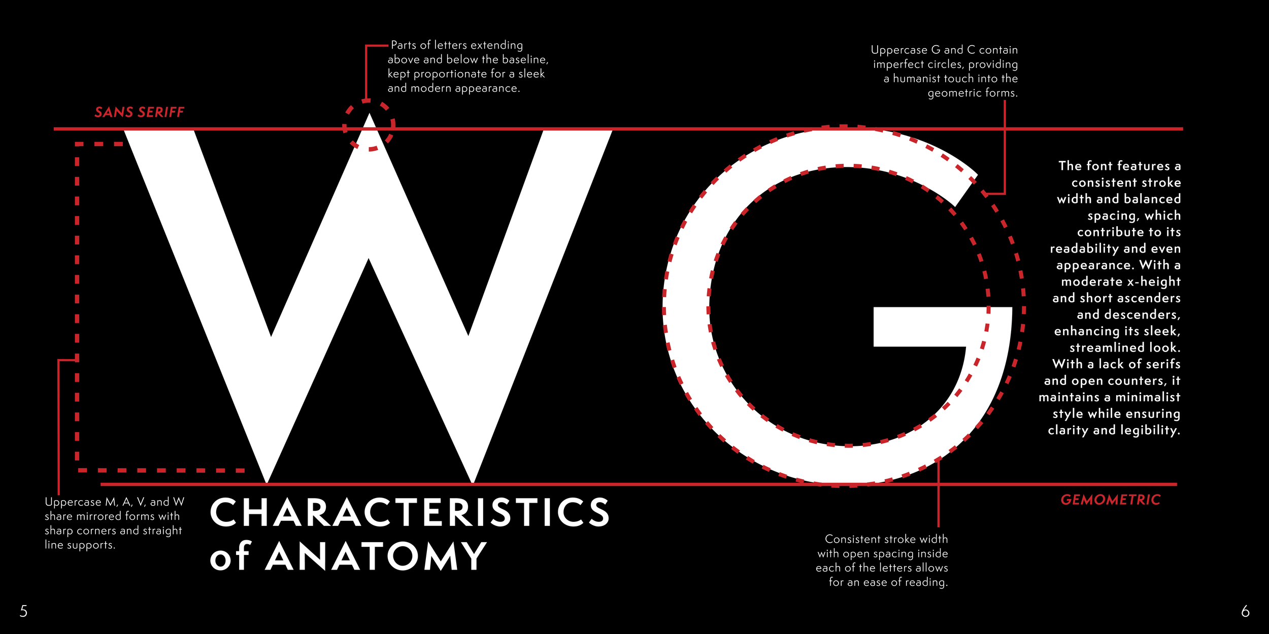
Grounding the direction of this specimen, Semplicita is a modern sans-serif typeface rooted in clarity, balance, and restraint.
Originally developed in the early 20th century, it reflects the era’s shift toward functional, streamlined forms, prioritizing legibility while maintaining a quiet sense of elegance. Its clean geometric structure, softened by subtle humanist details, informed the book’s pacing, hierarchy, and overall tone. By leaning into its versatility, the project uses Semplicita not just as content, but as a guiding system, allowing its contemporary yet timeless character to shape the visual language of the entire piece.
THE COLORS.
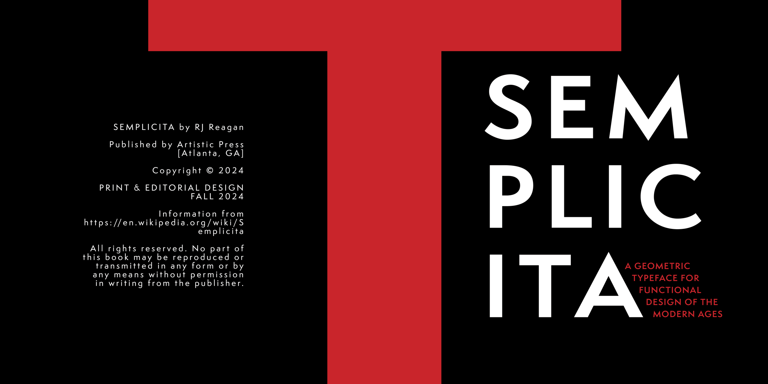
The visual language of the specimen is driven by a restrained, high-contrast palette of black, white, and red.
White typography sits sharply against deep black backgrounds, emphasizing clarity and legibility while reinforcing the typeface’s clean, modern character. Red is used sparingly as an accent, guiding the viewer’s eye, highlighting key information, and introducing moments of visual intensity. This limited color system mirrors Semplicita’s balance of restraint and expression, allowing the type itself to remain the focal point while creating a cohesive and striking reading experience.
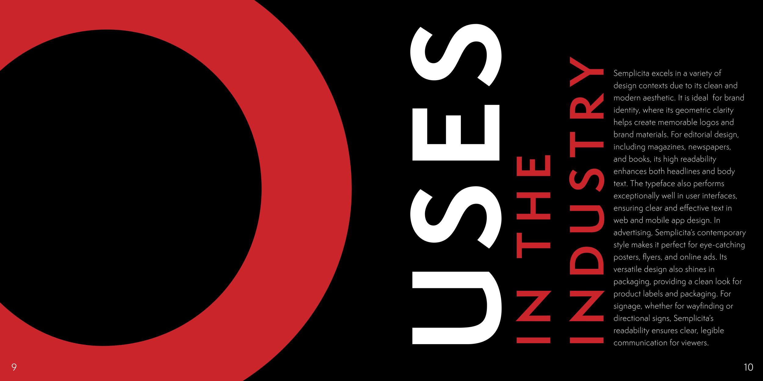
THE RESULT.
The final specimen book fulfills the project brief by presenting Semplicità as both the content and the framework, creating a system that is informative and visually engaging.
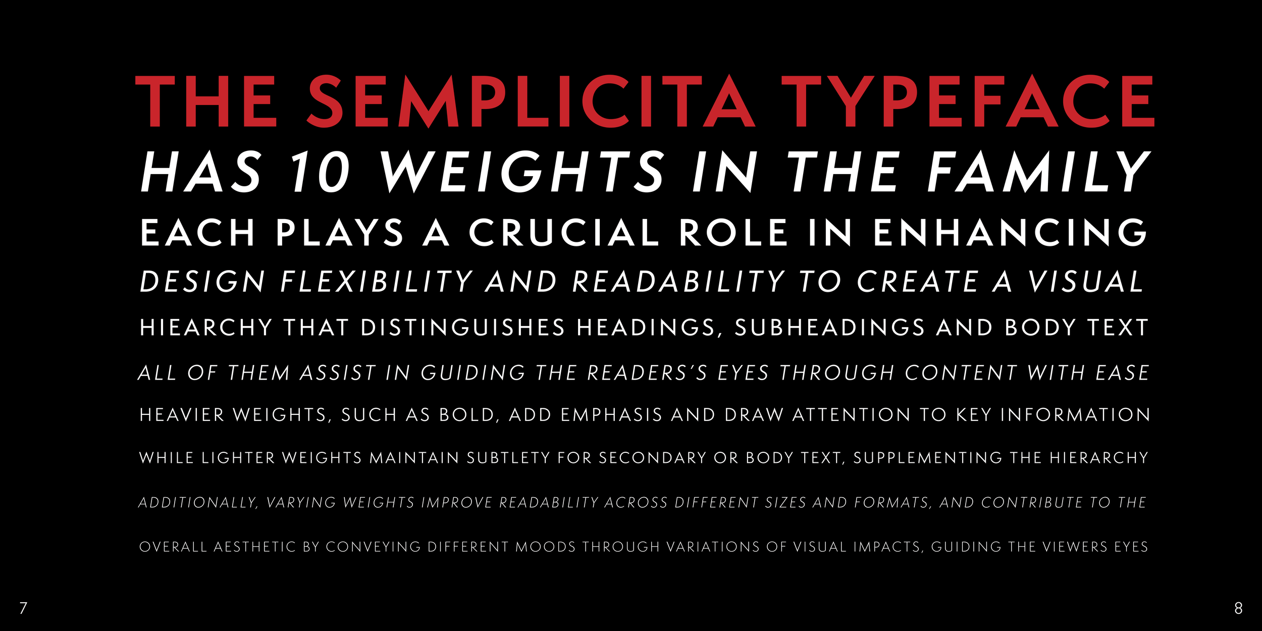
Informed by research into its history and geometric qualities, the design uses the typeface exclusively, relying on variations in scale, weight, and spacing to establish hierarchy and demonstrate its versatility. A restrained palette of black, white, and red creates strong contrast and guides emphasis, while enlarged letterforms and cropped details generate visual interest without additional graphic elements.
The result is a clear and cohesive specimen that effectively showcases Semplicità’s formal qualities while keeping the typeface as the primary focus.