SIPS BREWING CO.
BRAND IDENTITY - PACKAGING - ADVERTISEMENT
THE BRIEF.
This project focused on developing a brand from the ground up, including defining the company concept, shaping its product line, and applying a cohesive visual identity across packaging, advertising, and branded materials.
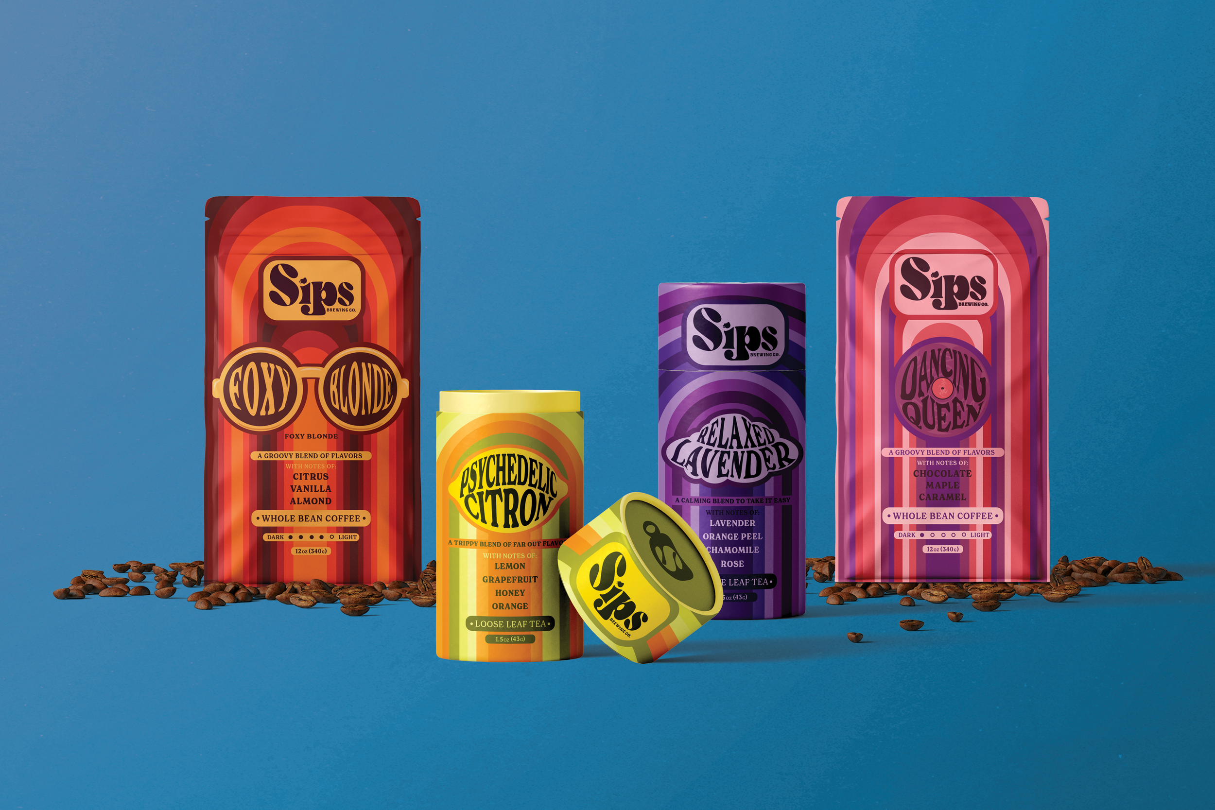
Sips Brewing Co. is a coffee and tea company inspired by the expressive graphic culture of the late 1970s. Drawing from the era’s musical energy, warm saturated tones, and bold typographic experimentation, the brand embraces rhythm and movement as central visual themes.
Project Length: 4 Months
Programs: Illustrator and Photoshop
THE LOGO.
The logo for Sips Brewing Co. is built as a bold, typographic wordmark inspired by the expressive display lettering of the late 1970s. Exaggerated curves, tight counters, and heavy weight create a rhythmic flow across the letterforms, echoing the musical undertones of the brand.
The integrated cup motif above the “i” acts as both a functional dot and a subtle product reference, reinforcing the brand’s focus on brewing while maintaining typographic cohesion. The soft, rounded geometry communicates warmth and familiarity, aligning with the sensory experience of coffee and tea.
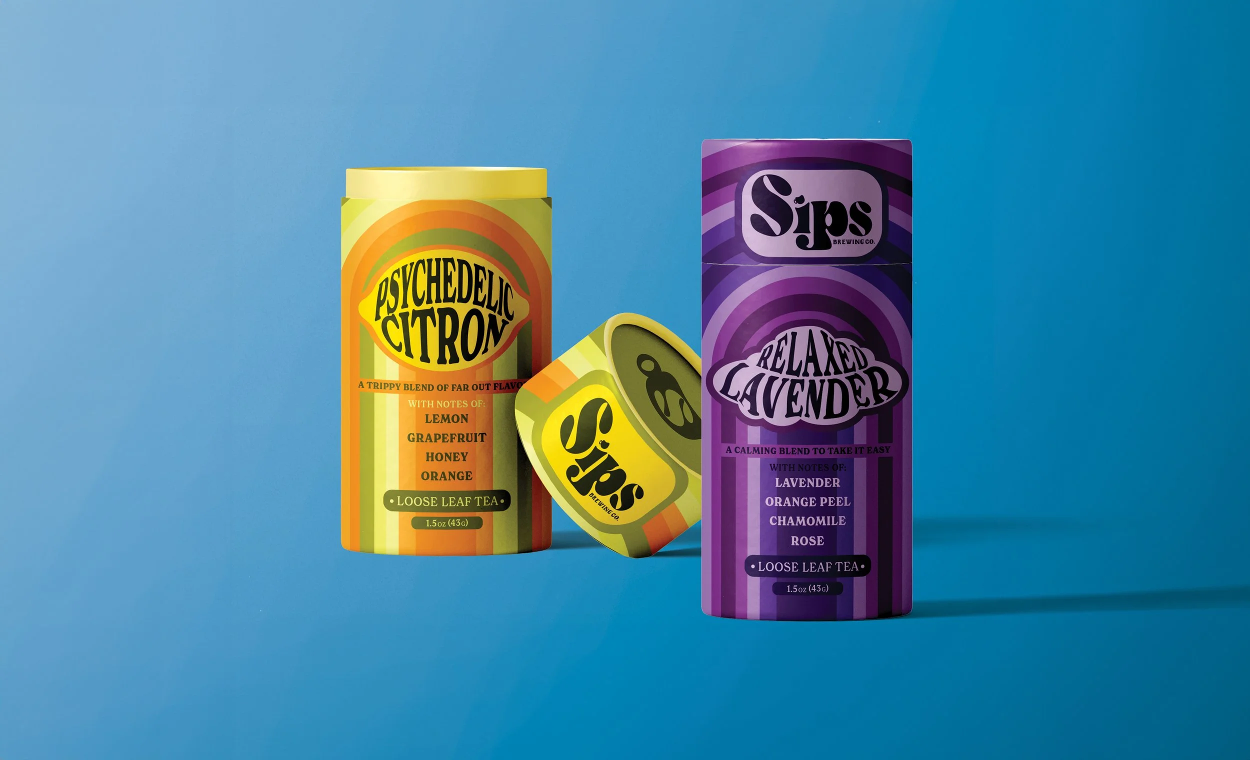
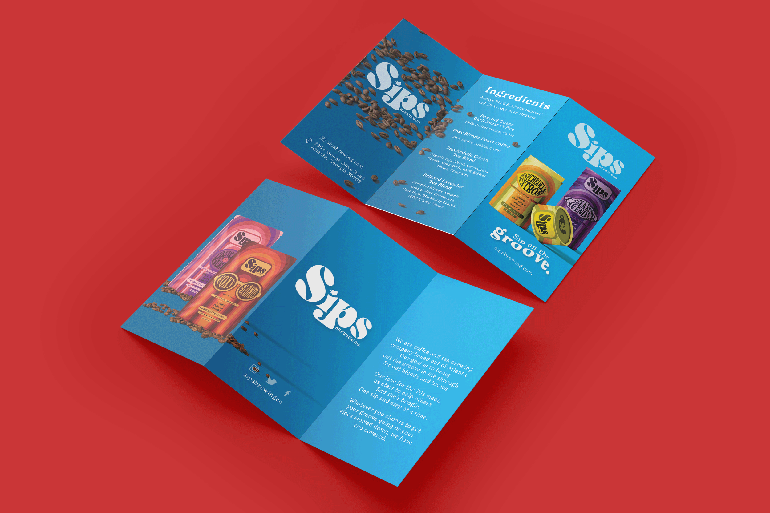
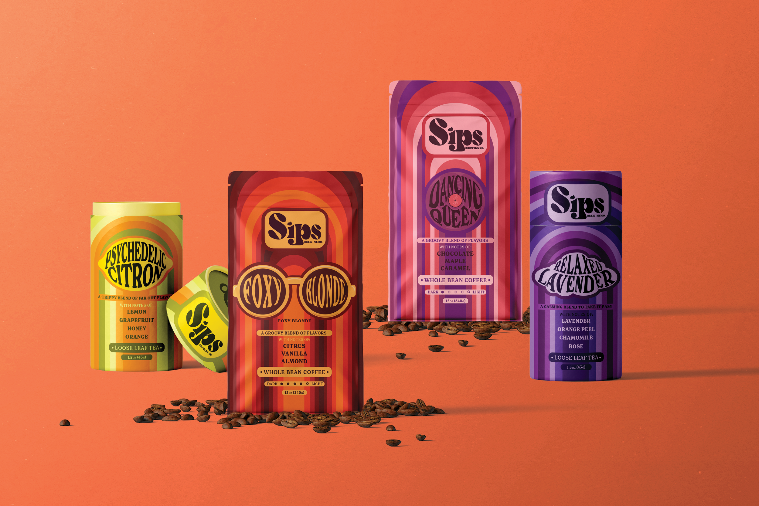
THE COLORS.
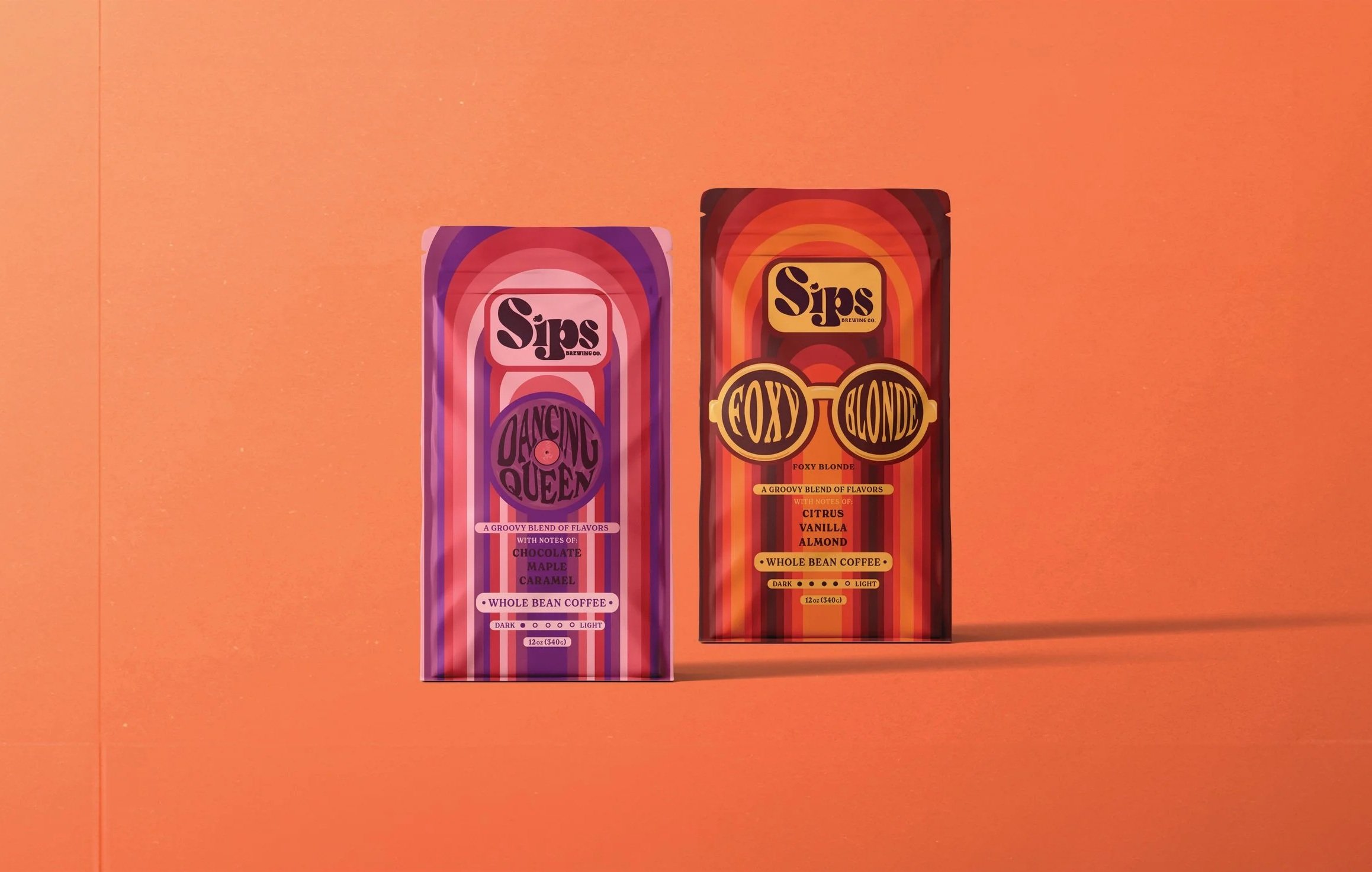
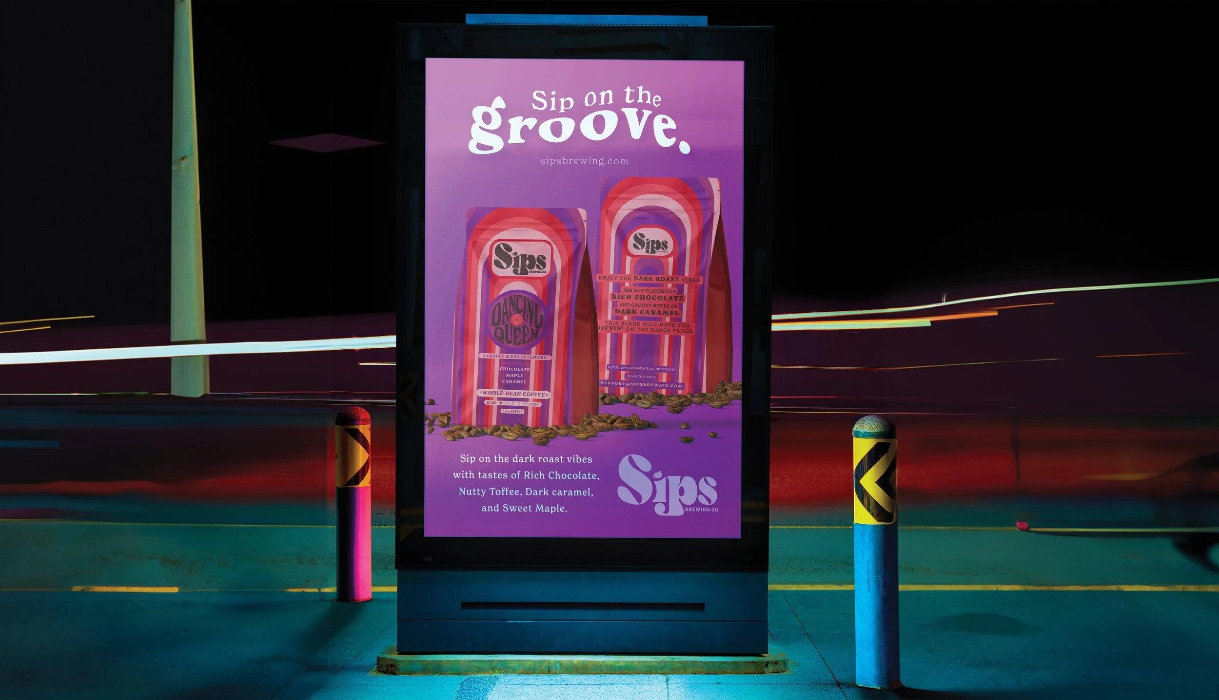
The campaign centers on a warm, saturated color palette drawn from late-1970s print culture. Yellows, reds, and deep purples anchor the identity, creating a sense of warmth, richness, and analog energy that reflects both the ritual of brewing and the musical vibrancy that inspired the brand.
While the overall palette remains cohesive, individual packaging colors shift depending on the specific coffee or tea blend. Each variety is distinguished through its own dominant hue, allowing the product line to feel dynamic and collectible while maintaining a unified visual presence across the brand
THE TYPE.
New Spirit Bold and Semi Bold are used across all packaging and advertising as the primary typefaces for the brand. Chosen for their expressive weight and soft, rounded forms, the type evokes the warmth and personality of late-1970s.
The type’s bold presence plays a central role in the identity, carrying much of the brand’s character. Used consistently across applications, it reinforces a cohesive visual voice that feels energetic, analog, and era-driven.
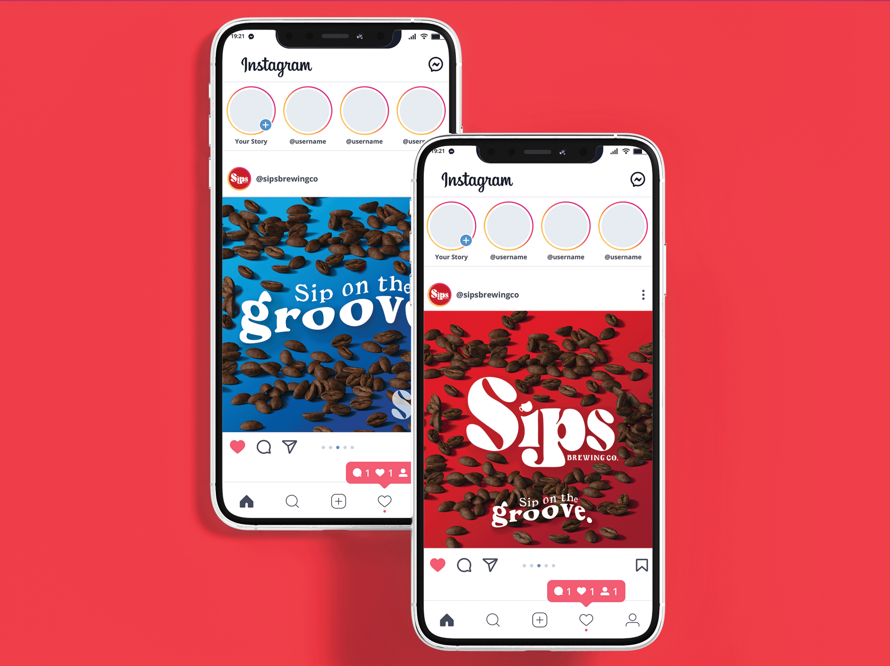
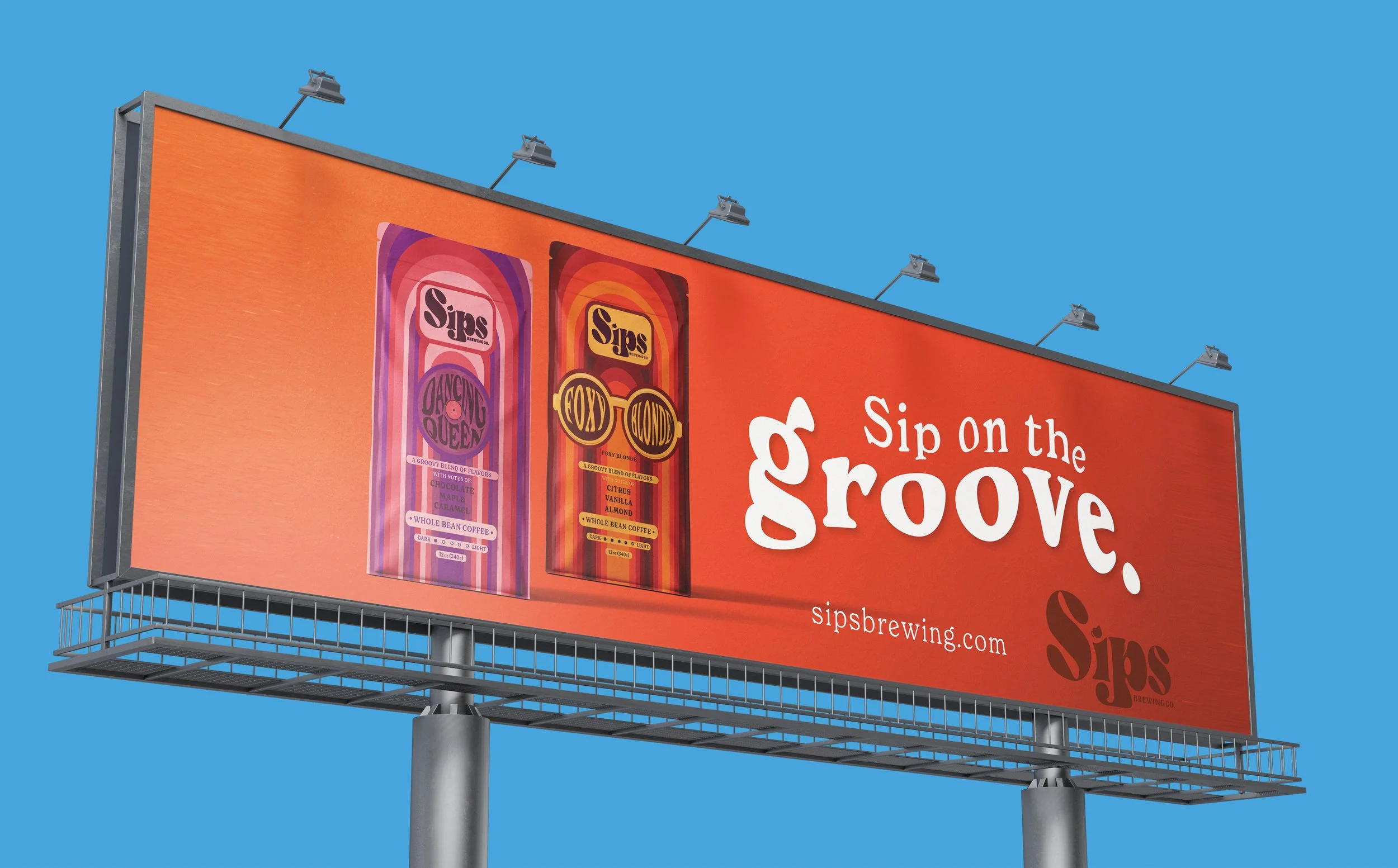
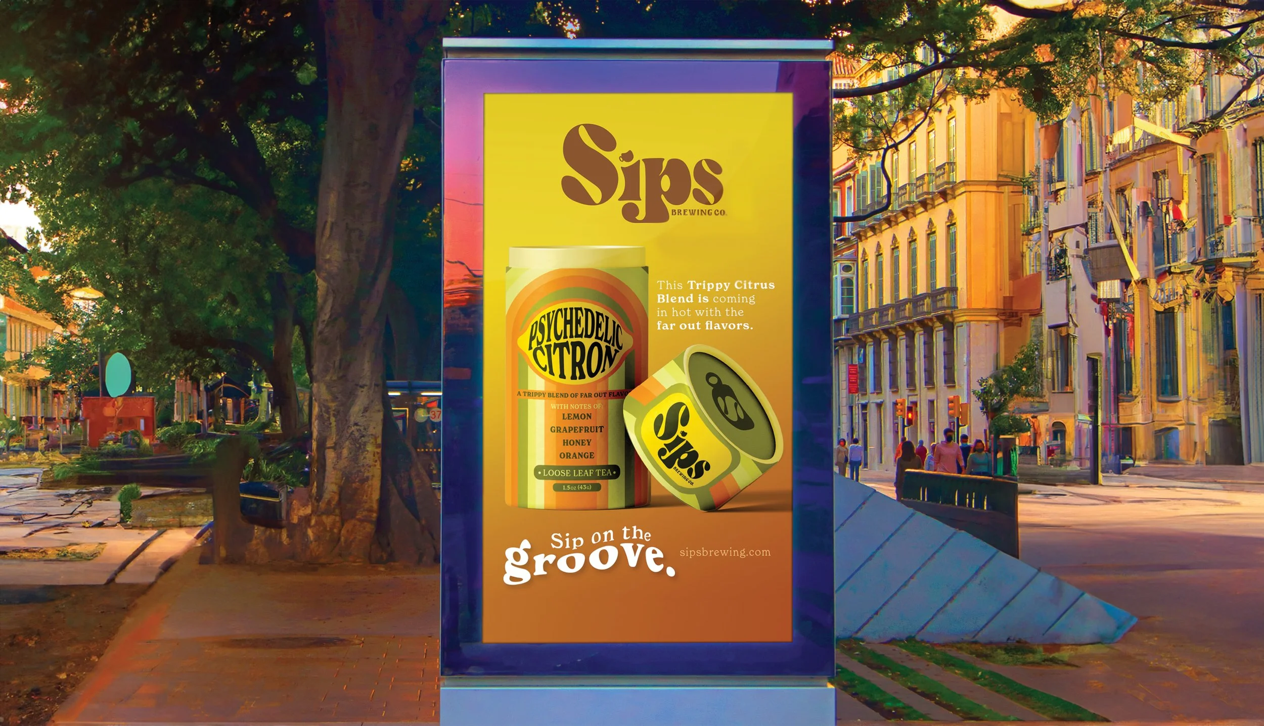
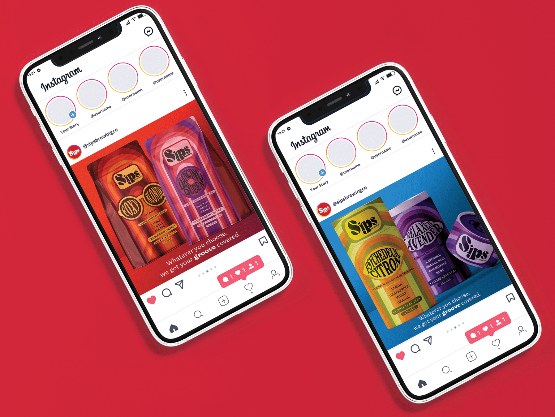
THE BRAND.
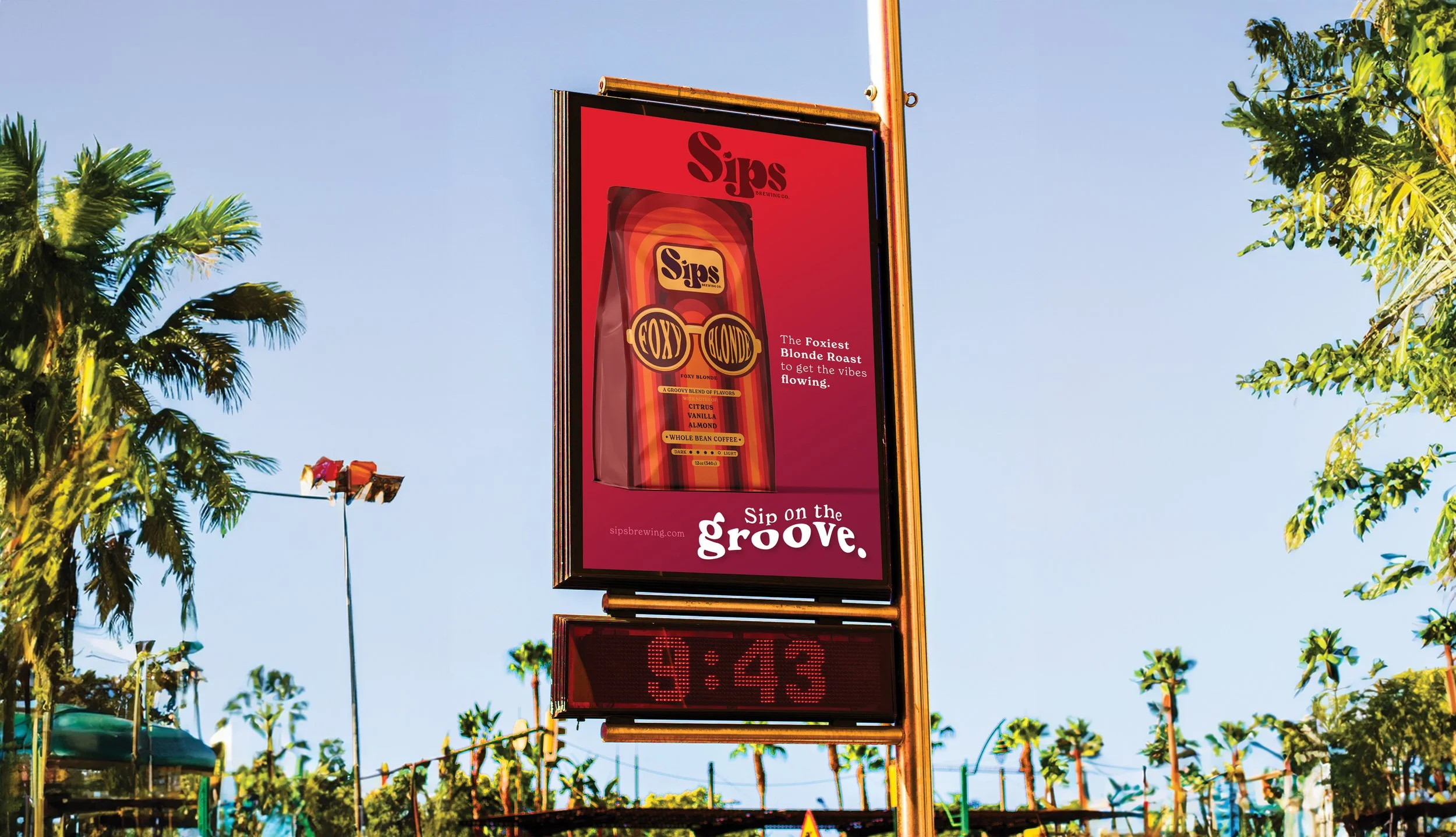
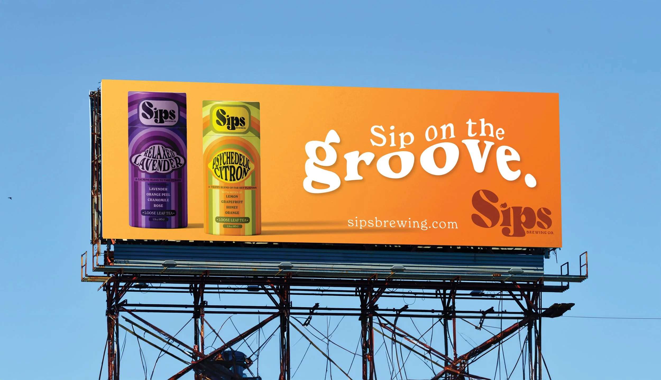
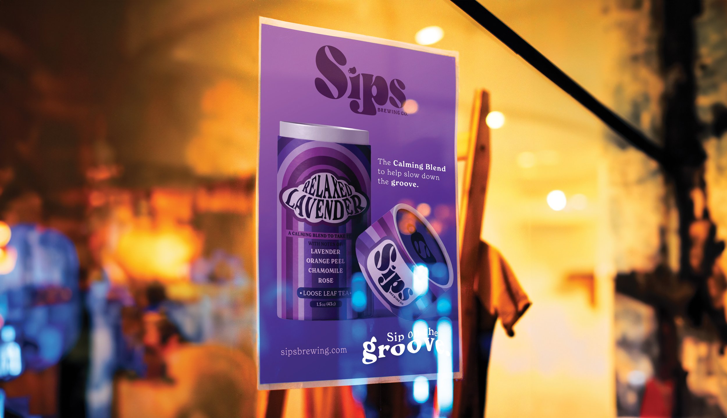
The campaign for Sips Brewing Co. keeps the product front and center while leaning fully into the brand’s rhythm-driven personality. Print ads spotlight the packaging as the hero, pairing bold compositions with short flavor callouts or the recurring tagline,
“Sip on the groove.”
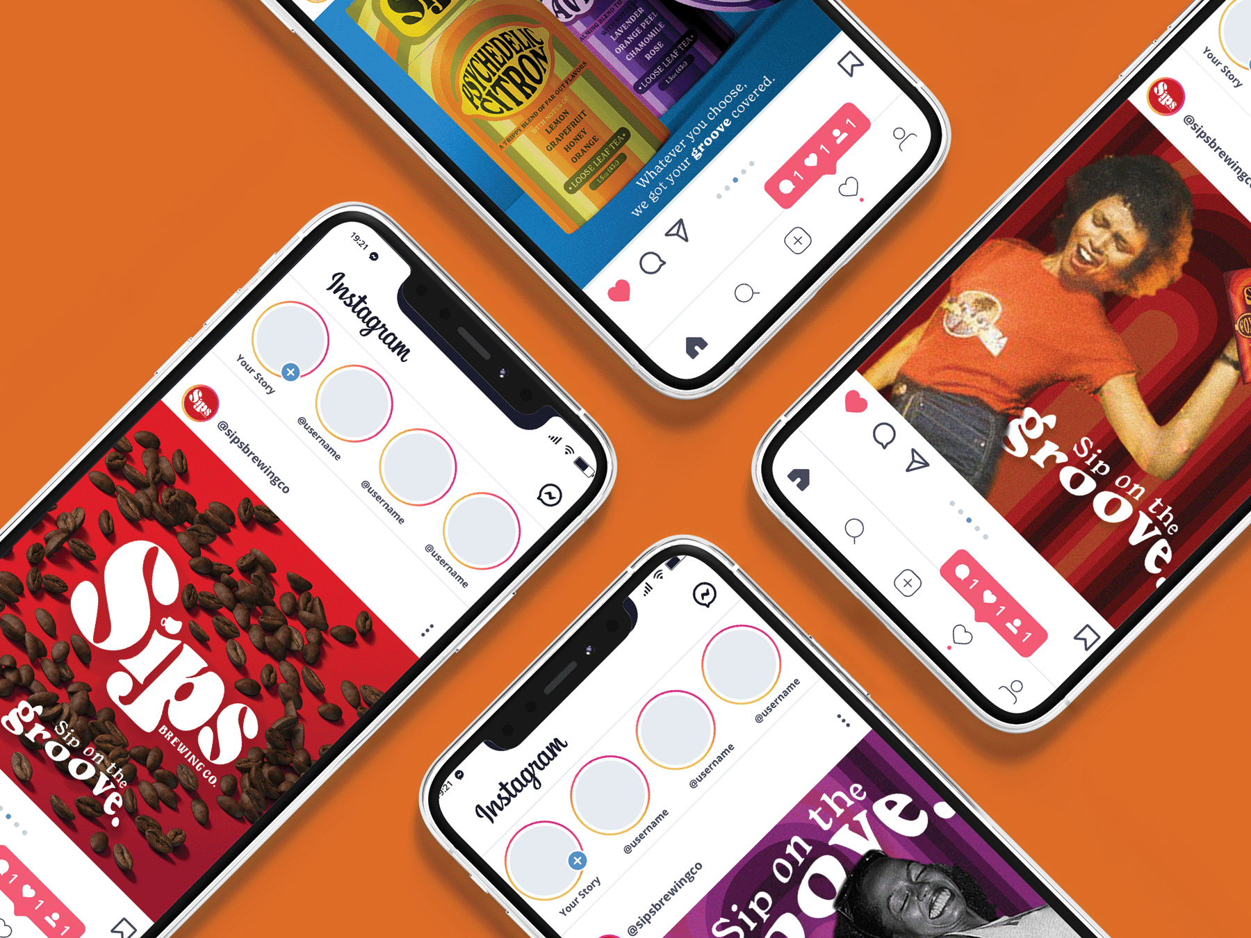
On social media, the campaign becomes more immersive and energetic. Stylized imagery inspired by disco-era movement places the product within expressive, dance-driven scenes, amplifying the connection between brewing and rhythm. The result is a cohesive campaign that feels lively, nostalgic, and distinctly rooted in 1970s culture while remaining visually focused and product-led.