80s REFRAMED
POSTER DESIGN CAMPAIGN
THE BRIEF.
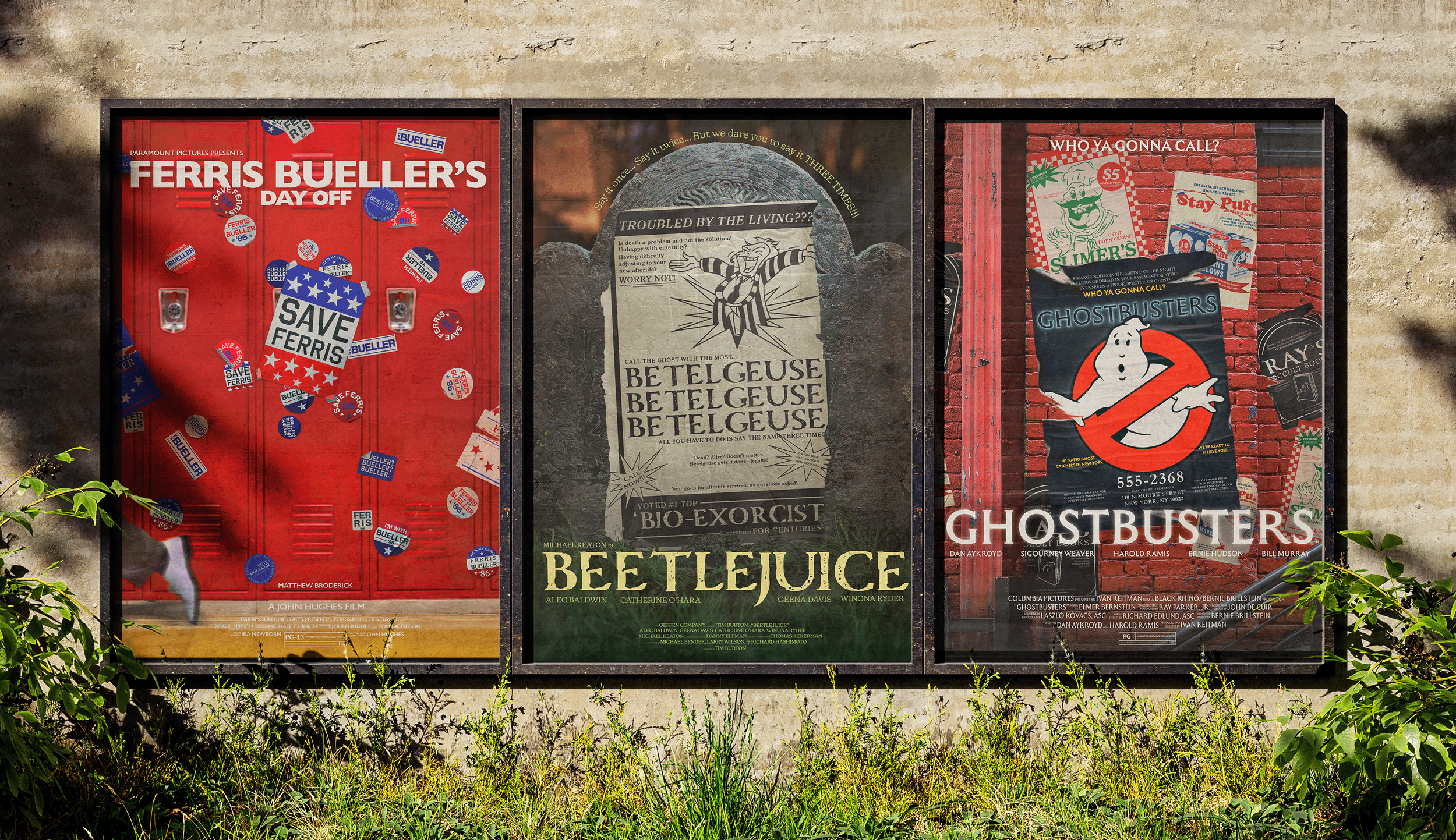
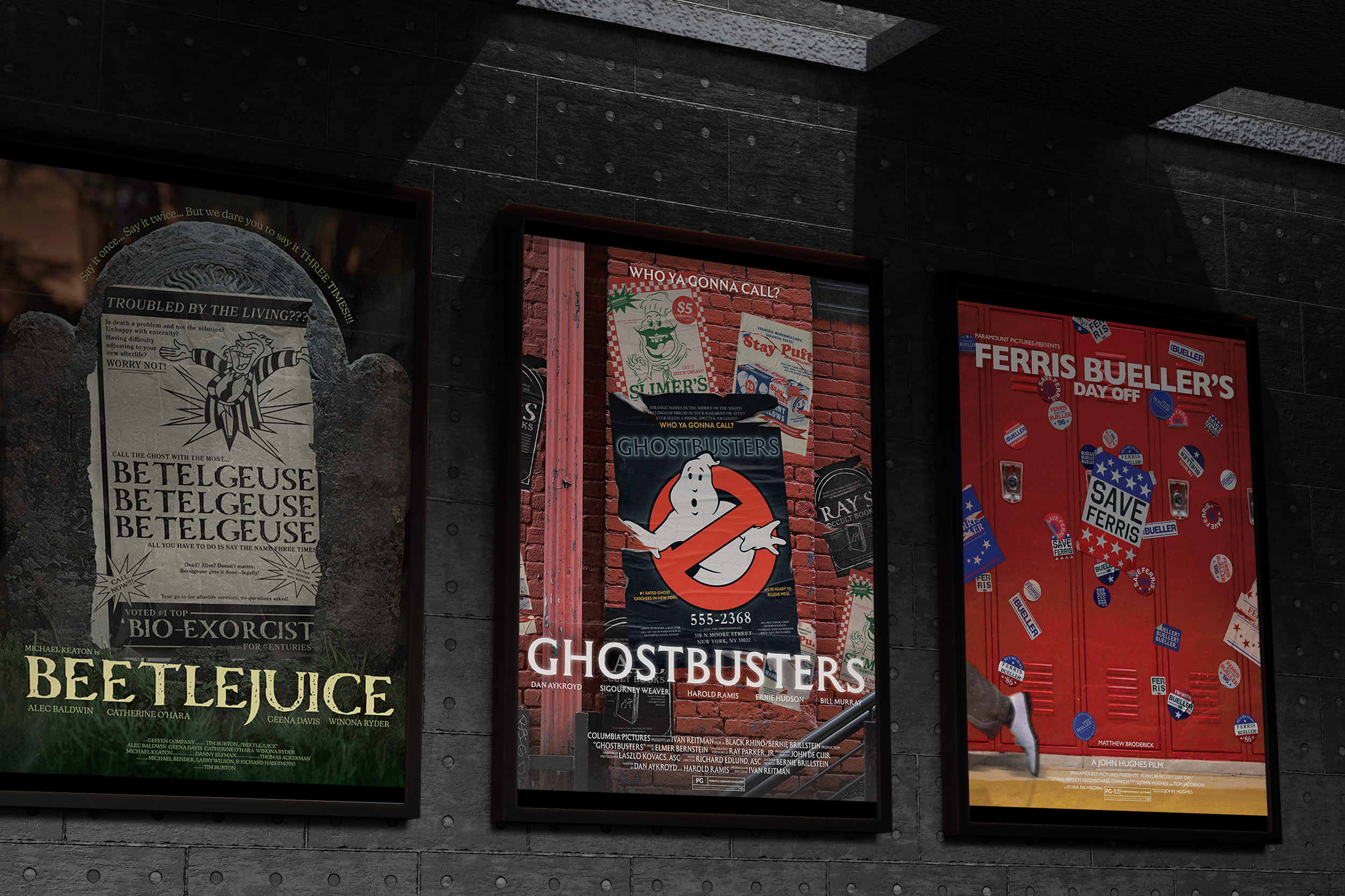
For this project, I chose to redesign three iconic 1980s comedy movie posters. Rather than creating faithful reproductions, I created each poster to focus “in-universe” artifacts; things the characters themselves might see within the world of the movie. Posters inside posters.
The goal was to balance nostalgia with fresh visual storytelling, exploring how humor, character, and narrative can be communicated through design. Each poster functions individually, but together they form a cohesive series that plays with the idea of meta-advertising within a cinematic universe.
Project Length: 1 Month
Programs: Illustrator, Photoshop, and Procreate
FERRIS BUELLER.
This poster reimagines Ferris Bueller’s Day Off. A campaign-style locker poster that students within the film might rally around. The political buttons style stickers/flyers plaster the lockers, playfully referencing typical high school microcosmic politics, turning Ferris into a larger-than-life figure while nodding to the humor and rebellion at the heart of the movie.
The design primarily uses red, white, and blue to evoke the vibrant energy of political campaigns while keeping the composition bold and visually striking. Gill Sans Nova was chosen for its clean, modernist feel, balancing playfulness with a sense of authority and readability, reinforcing the campaign aesthetic while letting the whimsical details shine.
BEETLEJUICE.
For this redesign of Beetlejuice, the poster as an in-universe advertisement placed in the afterlife. The design promotes “Bio-Exorcist” services, leaning into the dark humor of the story and positioning Beetlejuice as a chaotic, self-marketing businessman. The graveyard imagery sets the tone while grounding the piece in the film’s gothic, offbeat atmosphere.
The typography plays a key role in balancing humor and eeriness. Carta Marina Bold was chosen as the primary display face for its expressive, slightly irregular character; giving the headline a vintage, macabre personality that feels theatrical and a little unhinged. Bookmania Semibold supports the body copy with a classic, editorial serif presence, adding credibility and structure to the ad-like format. Together, the type pairing mirrors the film’s contrast between the formal, rule-bound afterlife and Beetlejuice’s unpredictable energy.
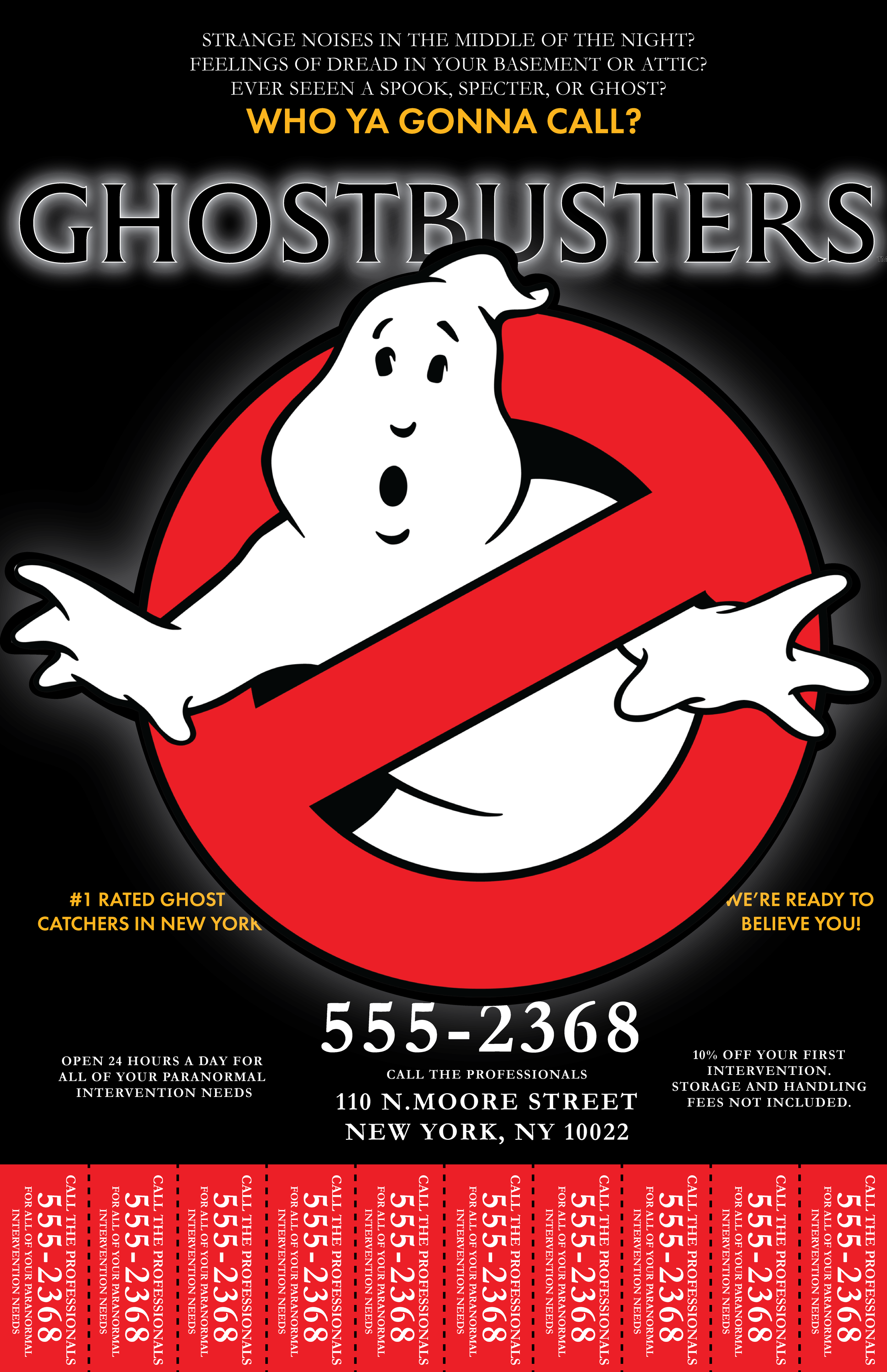
GHOSTBUSTERS.
The final piece in the trio is the Ghostbusters redesign. The poster is posed as a street-level advertisement created by the Ghostbusters themselves. The design functions as a practical, no-nonsense service flyer plastered onto a brick wall in New York City. Its layout emphasizes urgency and accessibility, positioning the team as scrappy entrepreneurs actively marketing their paranormal removal business.
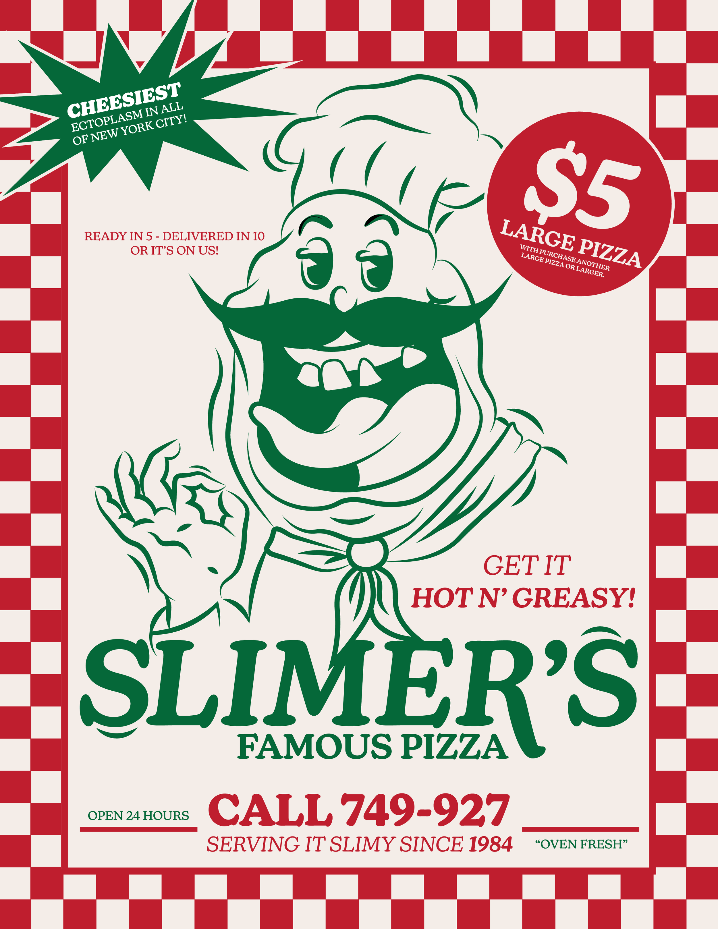
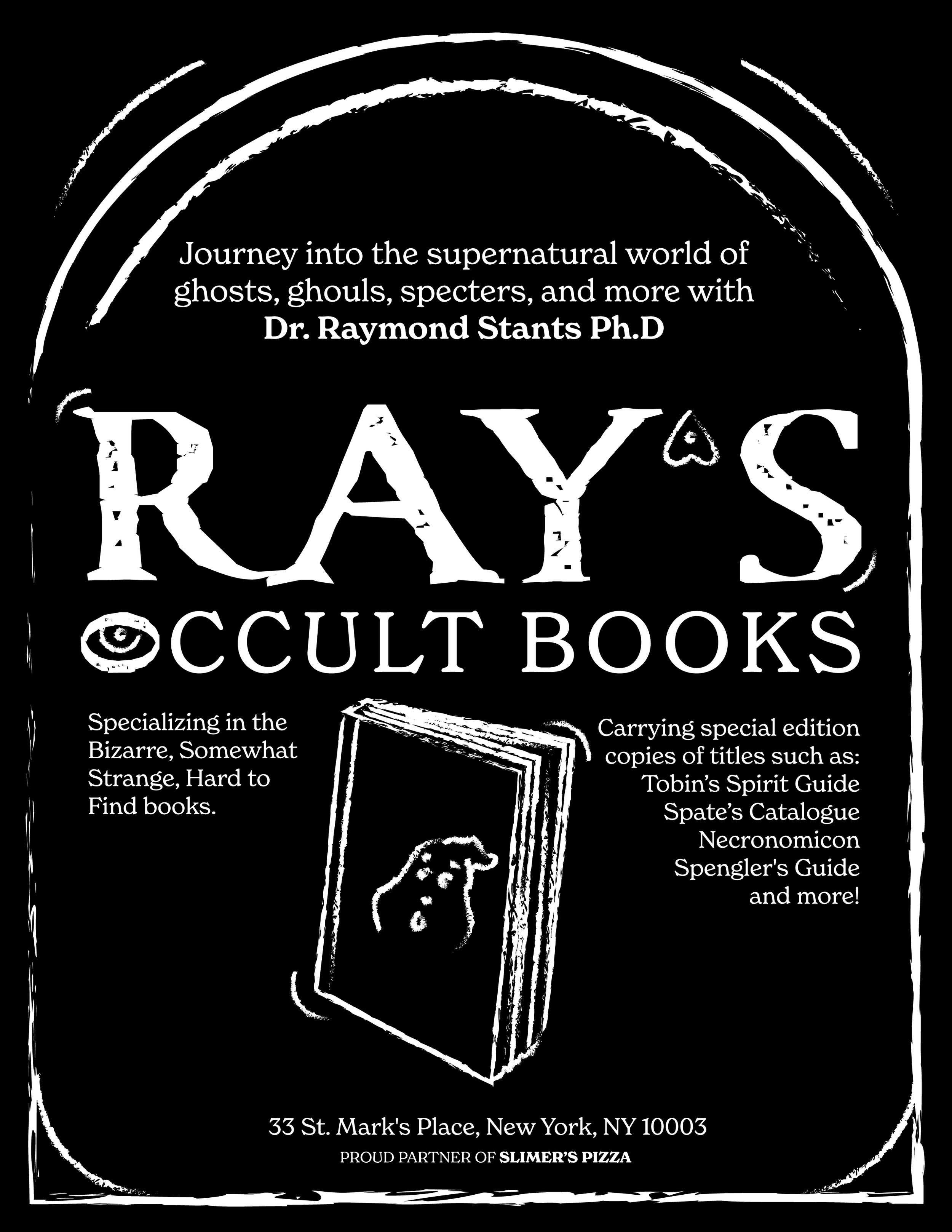
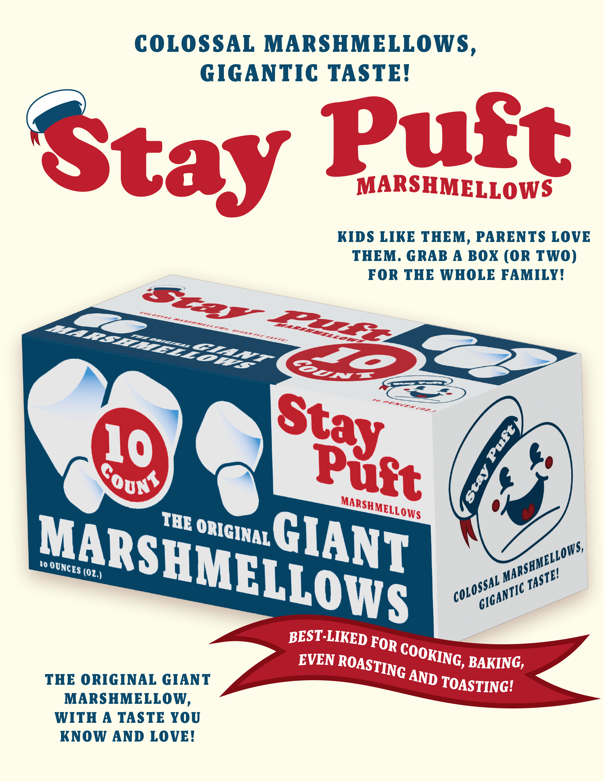
The surrounding background posters expand the world of the film and reinforce the in-universe concept. A pizza ad referencing one of the ghosts, a vintage-style Stay Puft marshmallow flyer, and a bookstore advertisement nodding to one of the protagonists all help build narrative context. Each supplemental poster was designed using visual cues drawn from 1980s advertising in order to help build the feeling on being in-universe; bold type, loud color contrasts, and promotional bursts.