ATL MUNICIPAL MARKET
BRAND IDENTITY - PACKAGING - ADVERTISEMENT
THE BRIEF.
In partnership with the Atlanta Municipal Market, our team of three developed a potiental refreshed brand identity that honors the Market’s rich history while appealing to a new generation of visitors. The project included a cohesive branding system, merchandise, environmental graphics, and an integrated ad campaign.
Project Length: 4 Months
Programs: Illustrator and Photoshop
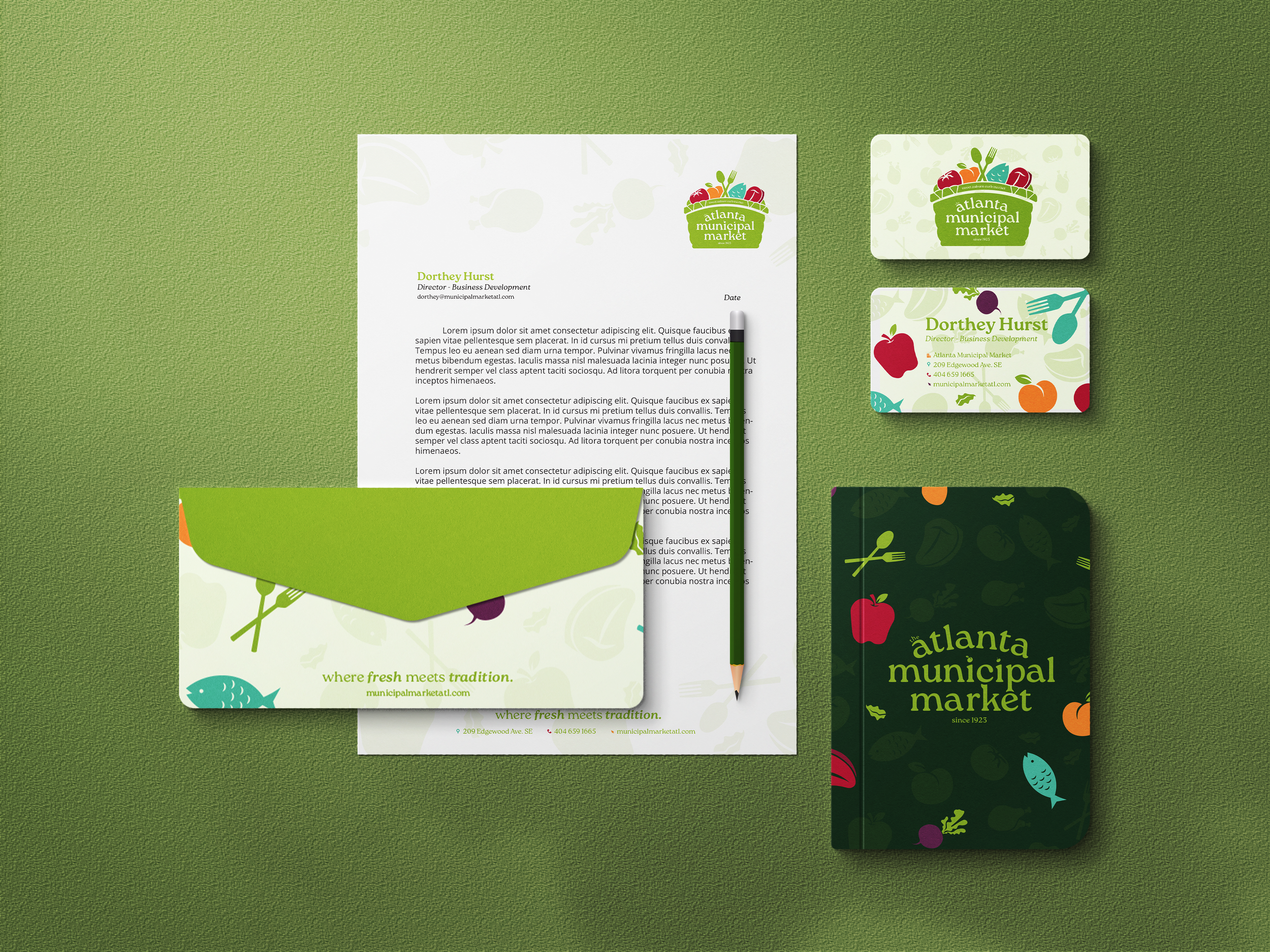
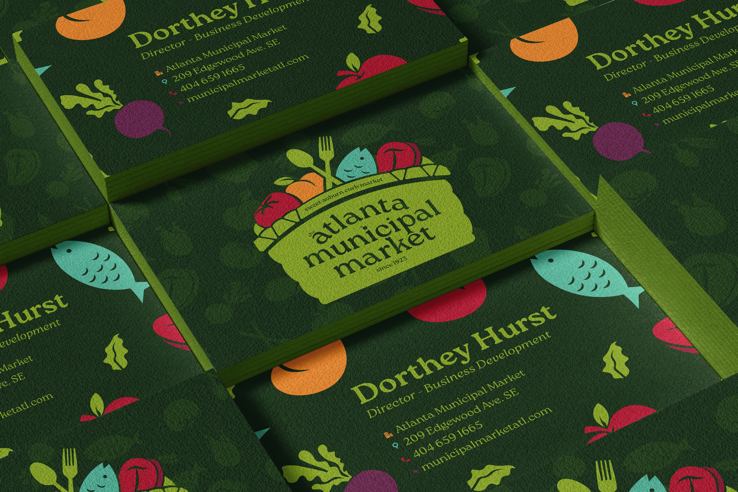
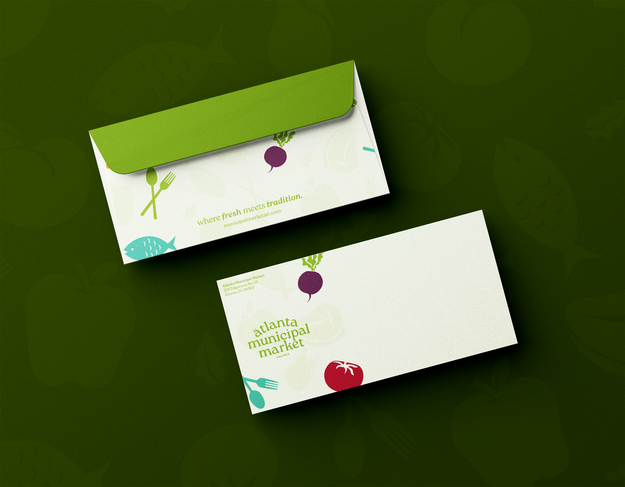
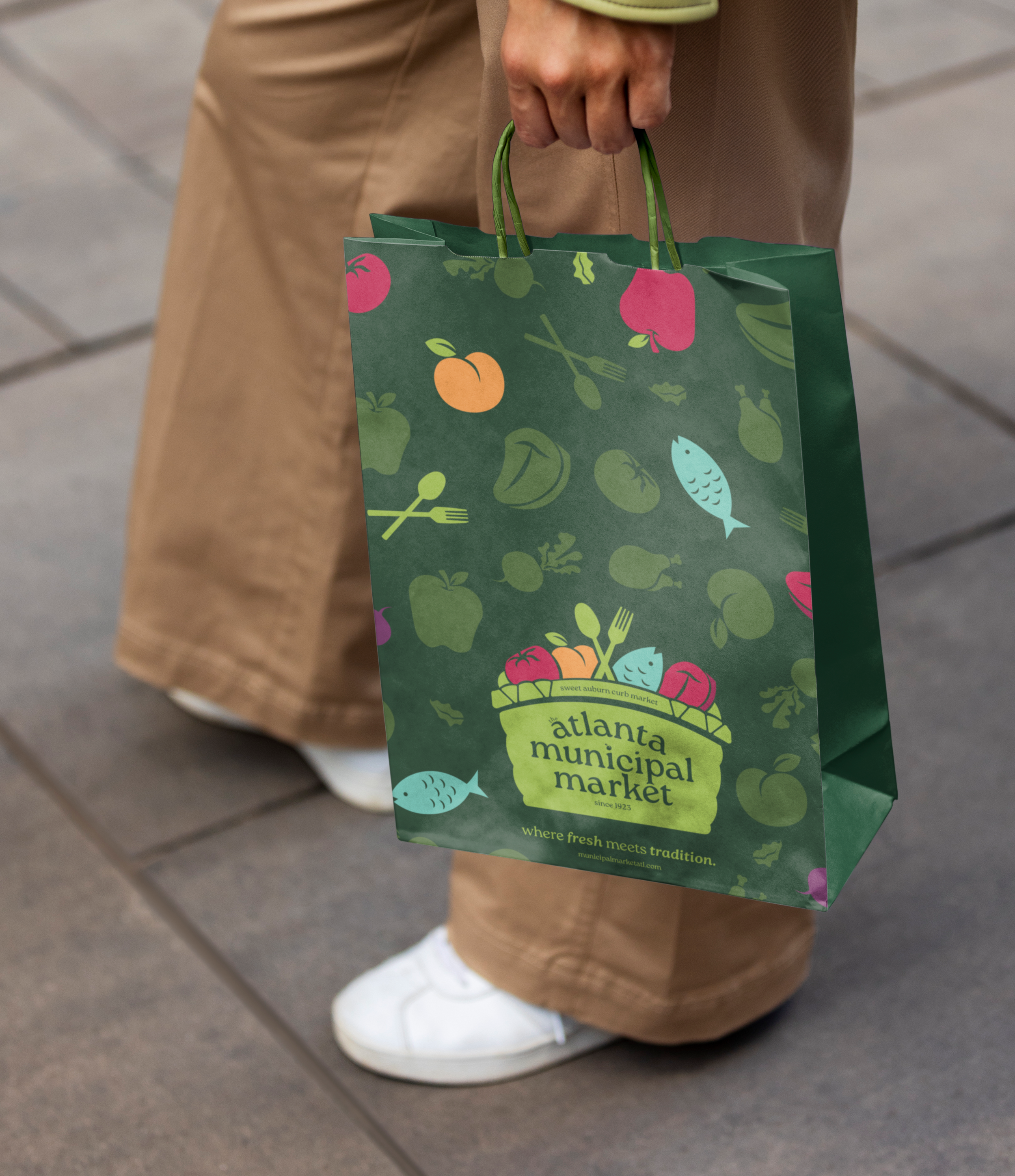
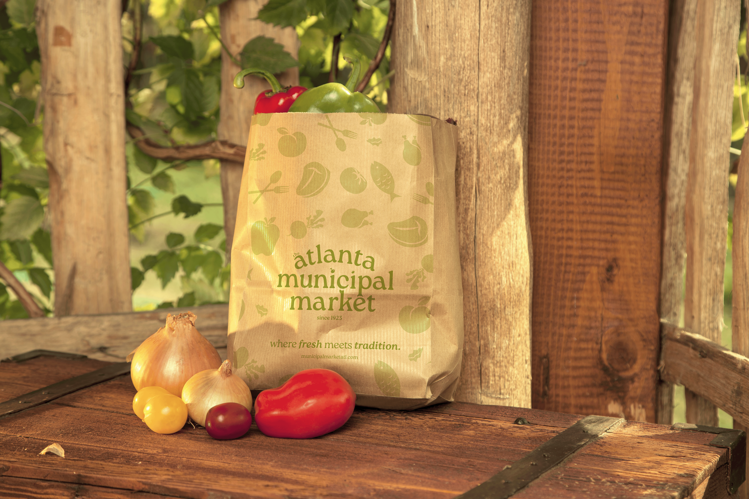
THE LOGO.
The Atlanta Municipal Market logo reimagines a historic identity through a contemporary lens.
Inspired by vintage market signage, the badge-style mark feels rooted and familiar, while the simplified forms and clean typography give it a refreshed, modern presence.
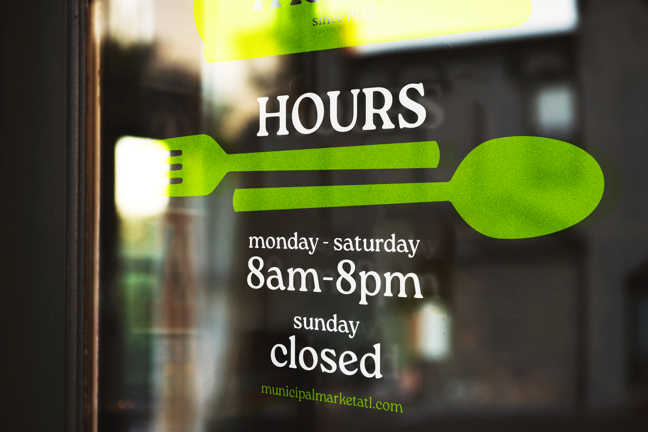
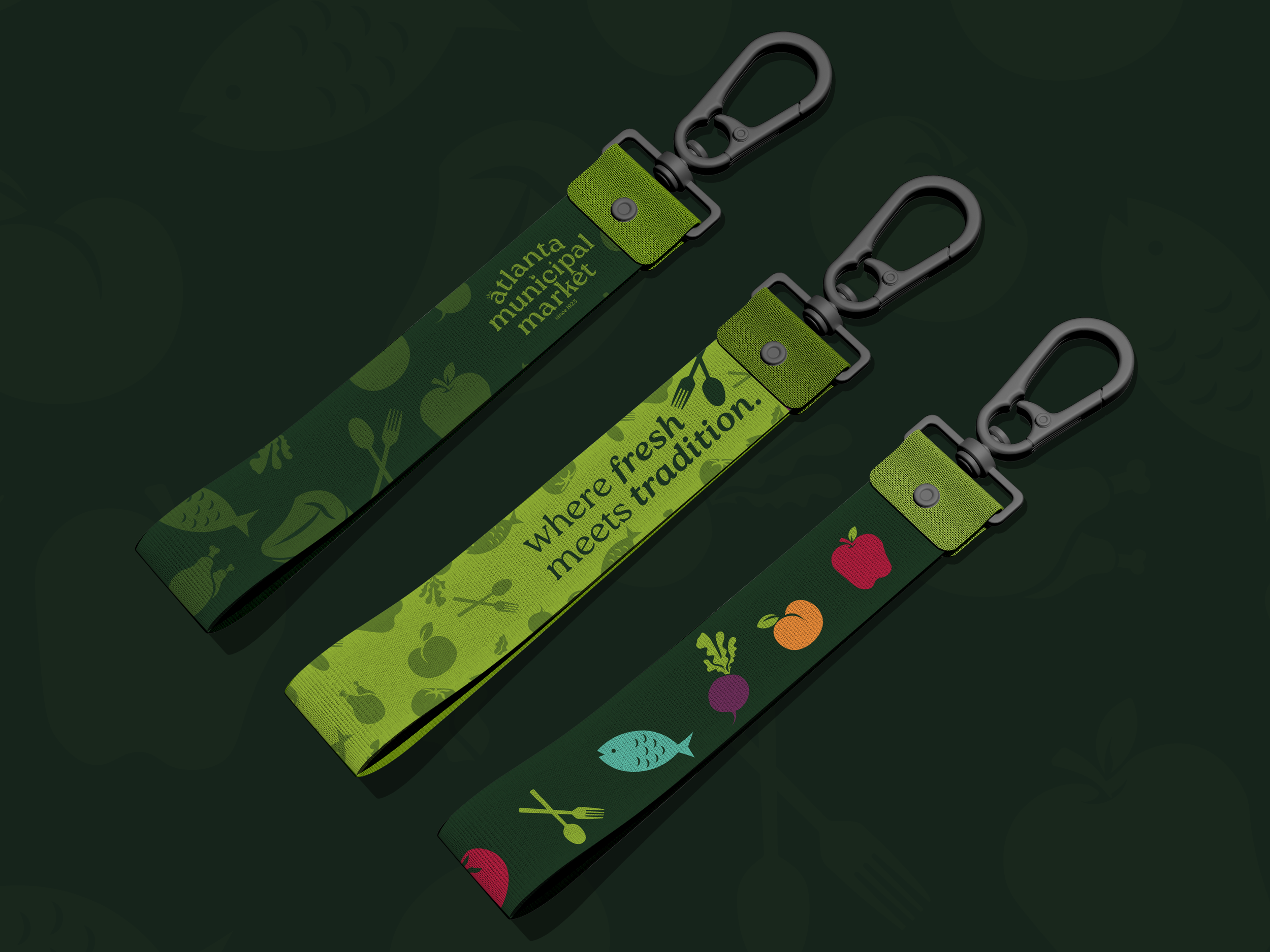
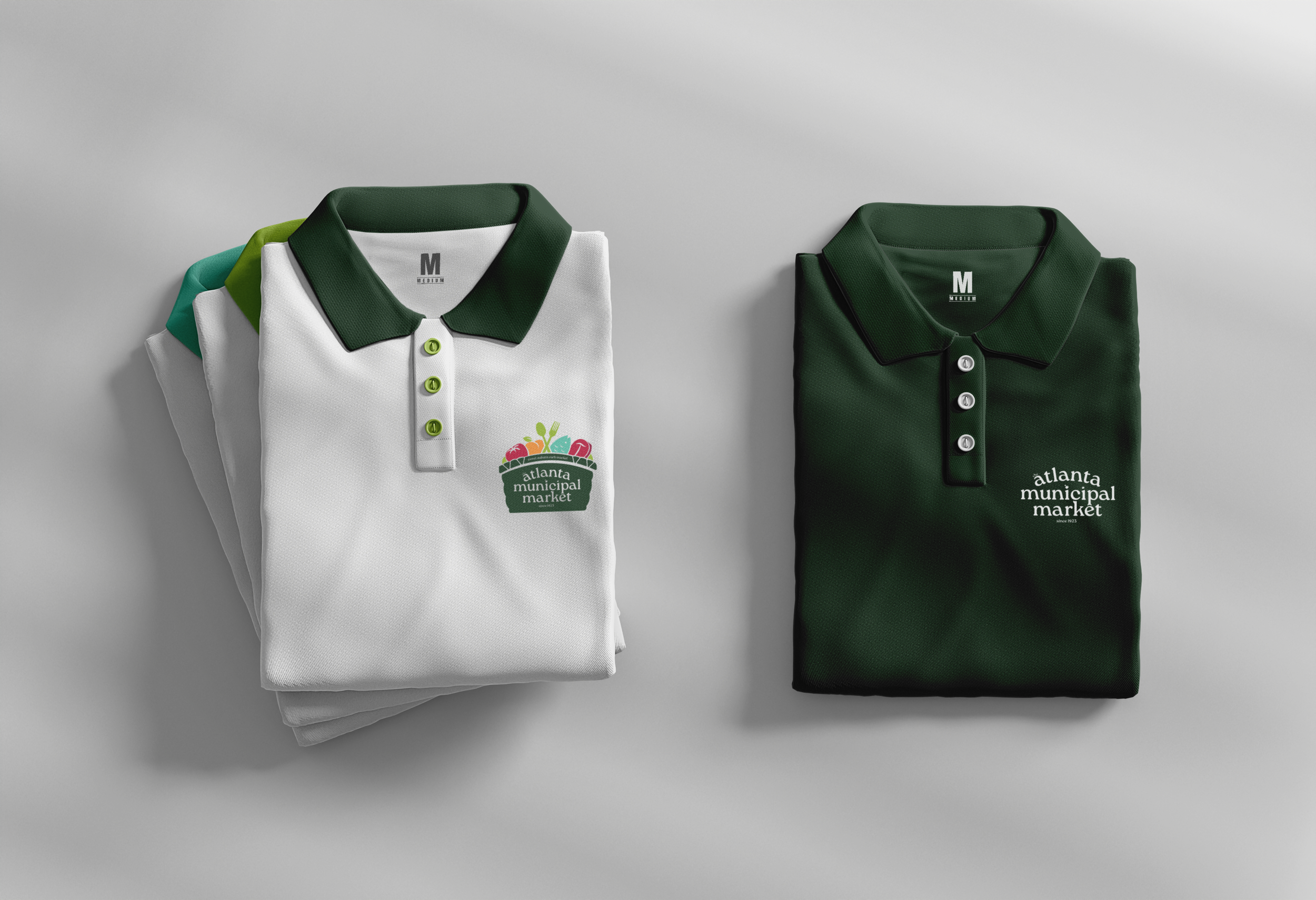
The basket motif and produce icons nod to the Market’s legacy of fresh, local goods, while the bold green palette reinforces a sense of growth and vitality. Altogether, the logo feels welcoming and community-driven—honoring the past while inviting a new generation in.
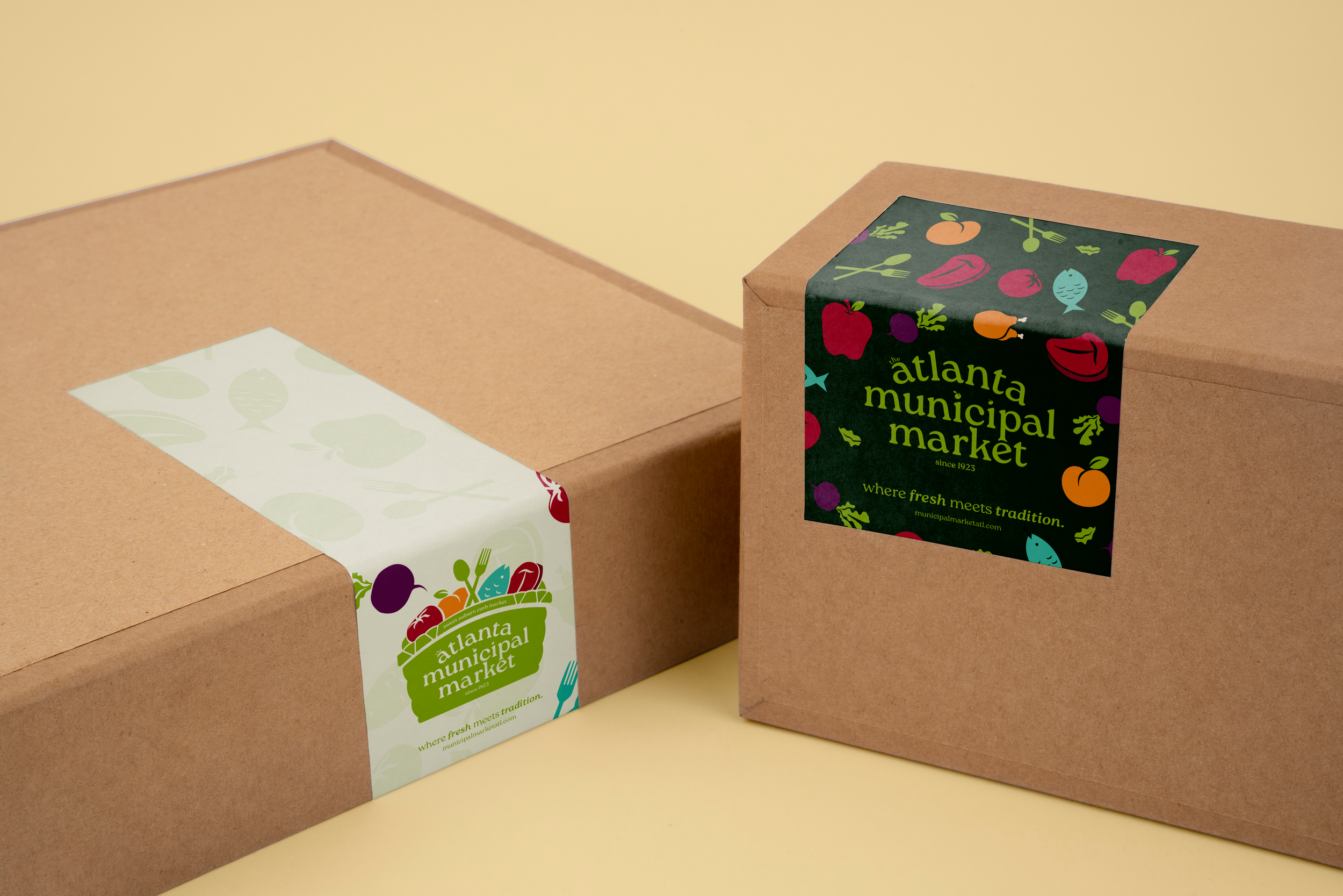
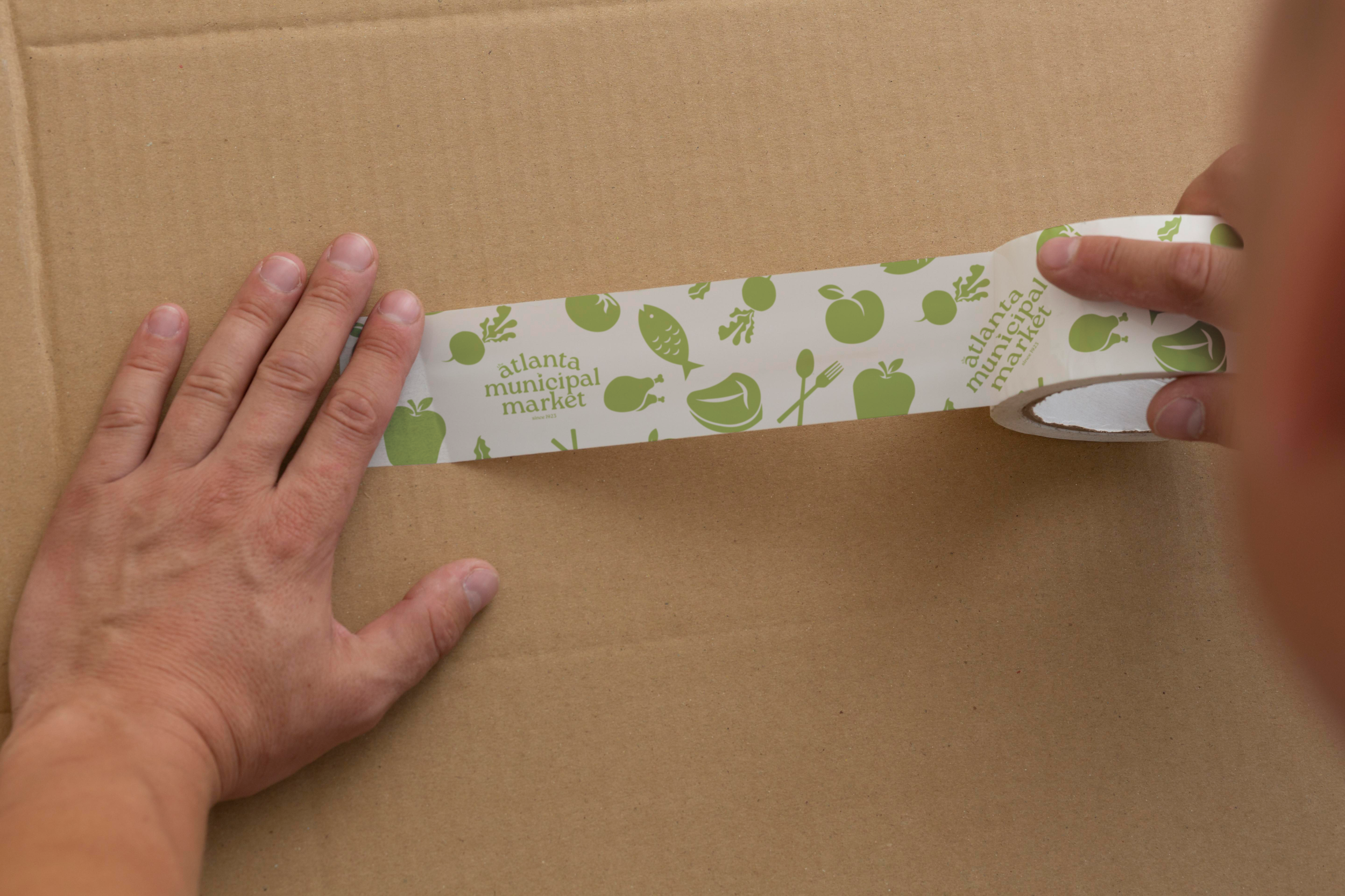
THE COLORS.
The color palette draws directly from the Market’s identity, using deep greens paired with vibrant produce-inspired hues. The rich green anchors the brand in tradition and heritage, while the brighter reds, oranges, and teals bring in a sense of freshness, energy, and diversity.
Together, the colors reflect both the historic roots of the Market and the lively, contemporary atmosphere it holds today. The palette feels natural, inviting, and community-focused; grounded in the past but full of life.
THE TYPE.
The typography centers on Roca in both Light and Bold, striking a balance between vintage character and contemporary clarity.
Its soft curves and subtle personality helps reference those ideas of traditional market signage, while the clean structure keeps it feeling current and approachable.
Using the weight contrast between Light and Bold creates hierarchy without losing warmth, allowing the type to feel welcoming, fresh, and confident. The result supports the brand’s overall intended direction; heritage-inspired, but thoughtfully modernized for today’s audience.
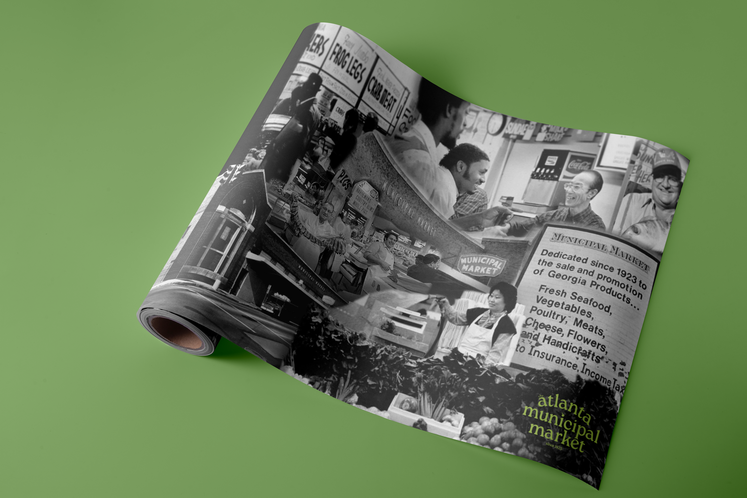
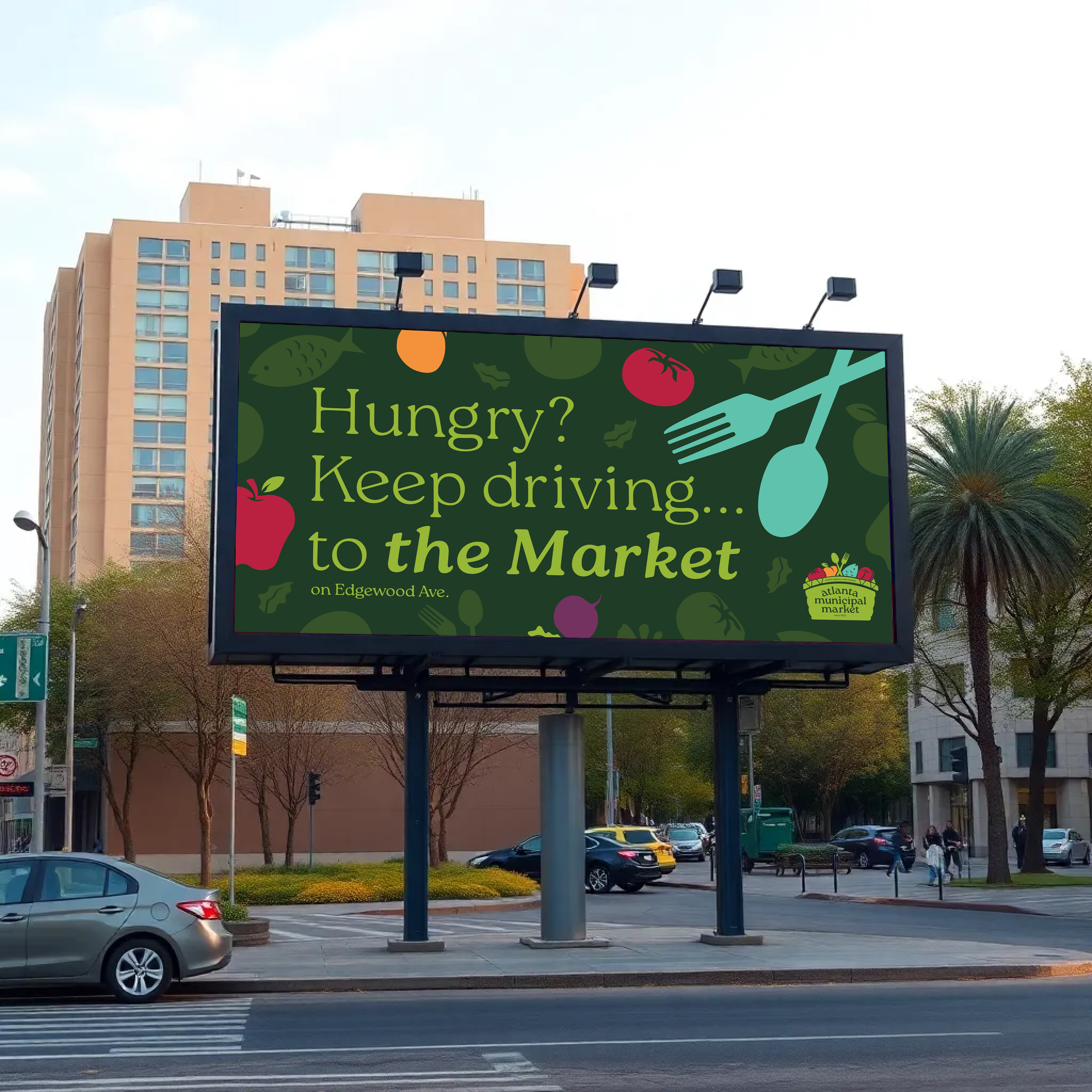
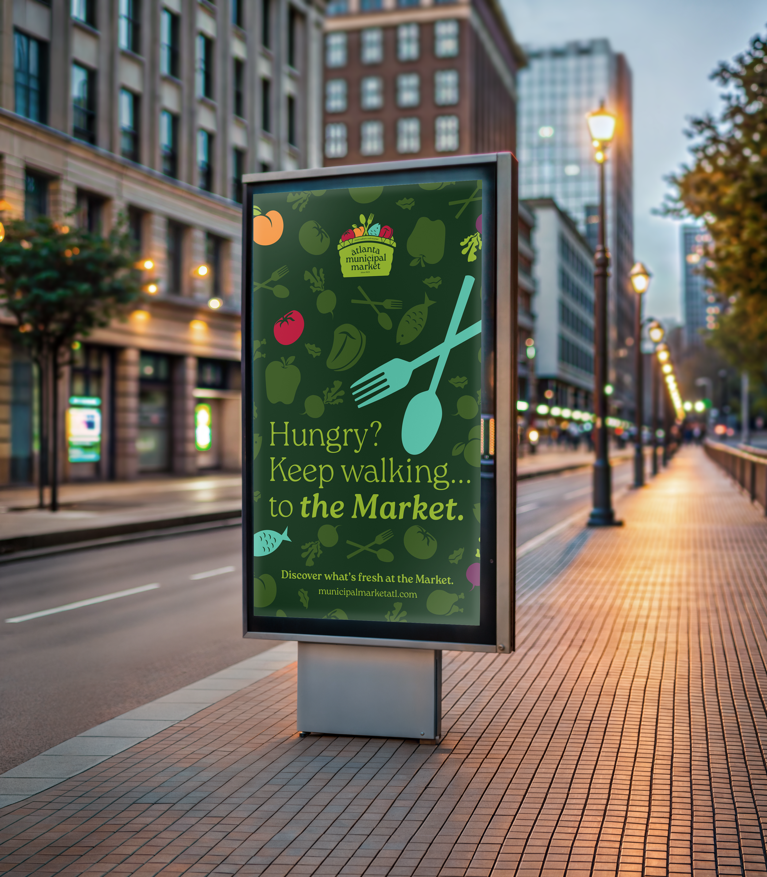
THE BRAND.
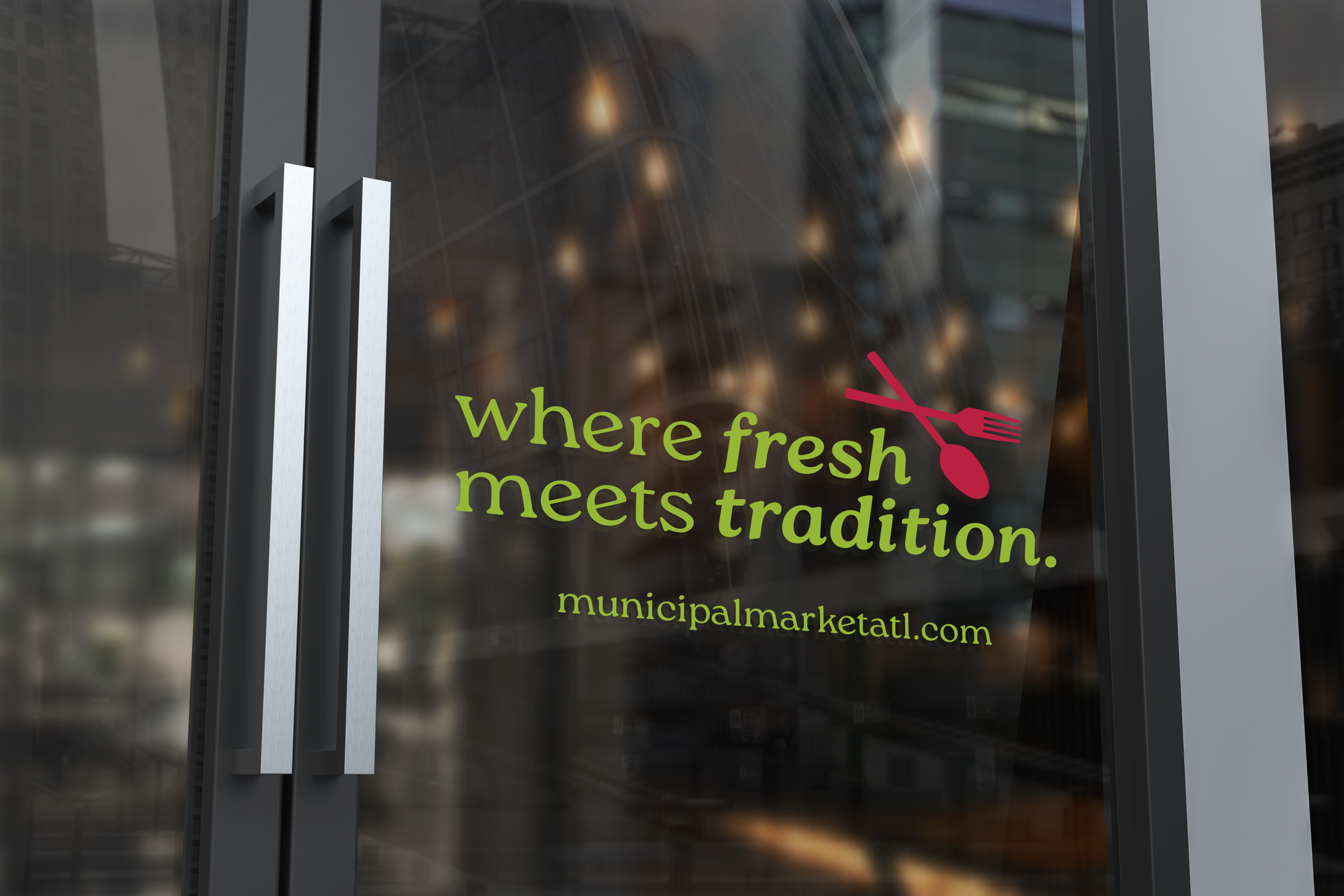
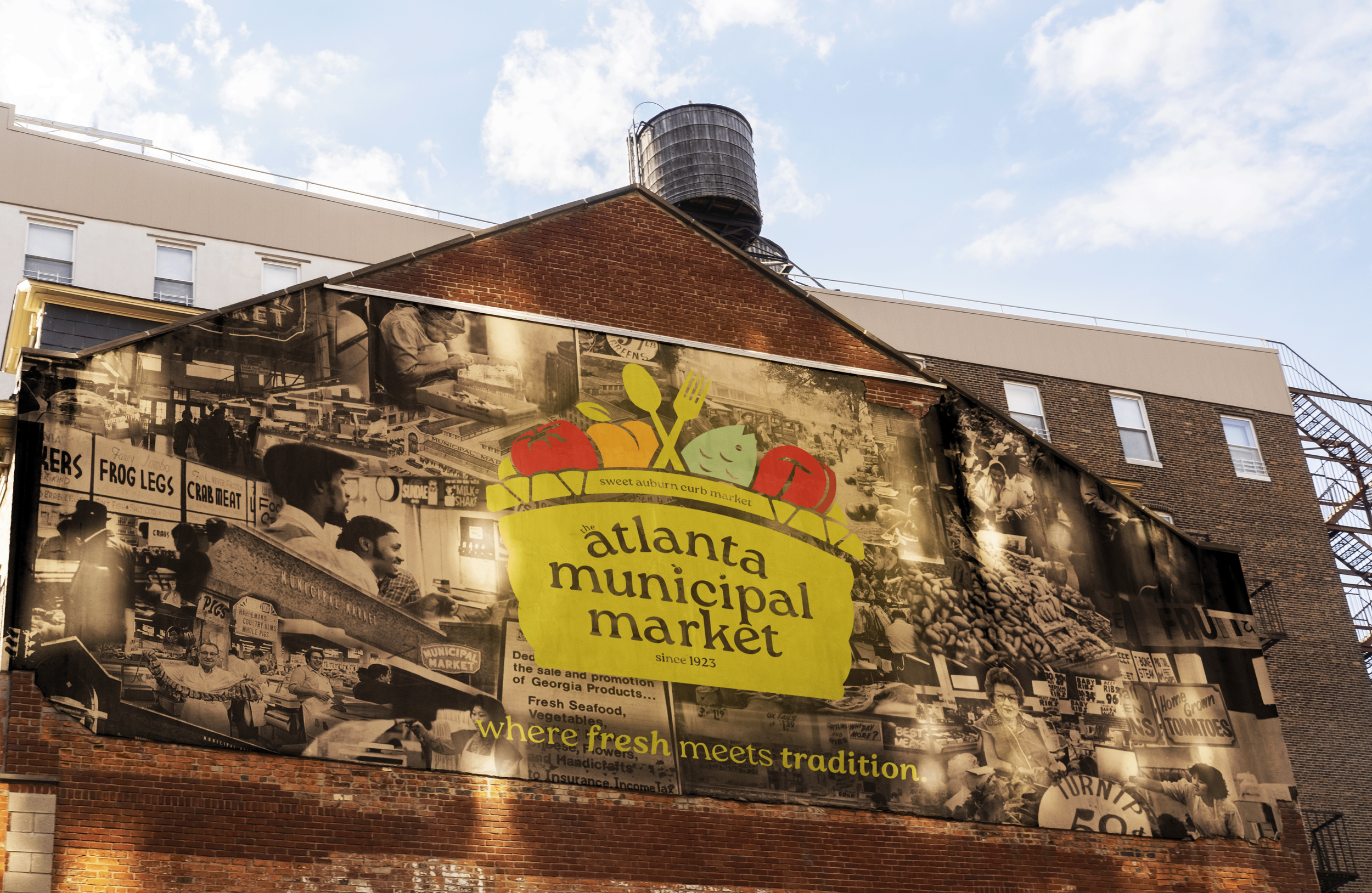
“Where fresh meets tradition.”
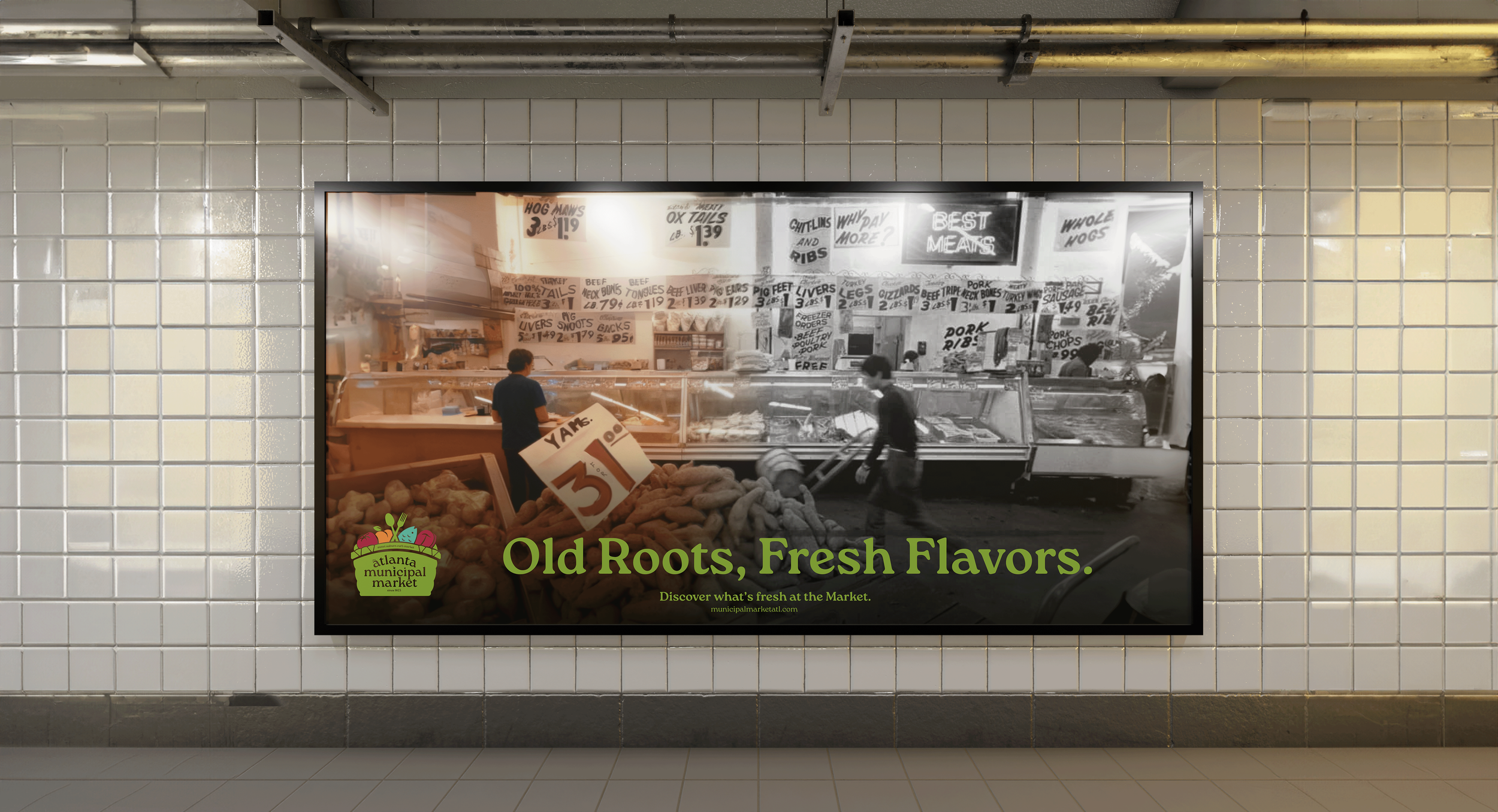
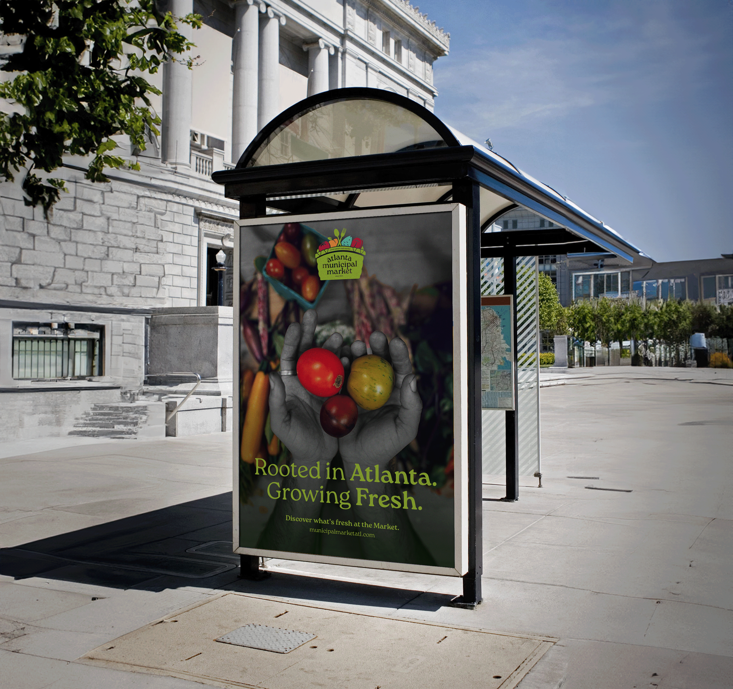
The slogan served as the foundation of the campaign, reinforcing the Market’s identity as a place where heritage and modern culture coexist. The message extended beyond copy and was reflected directly in the visual language of the ads.
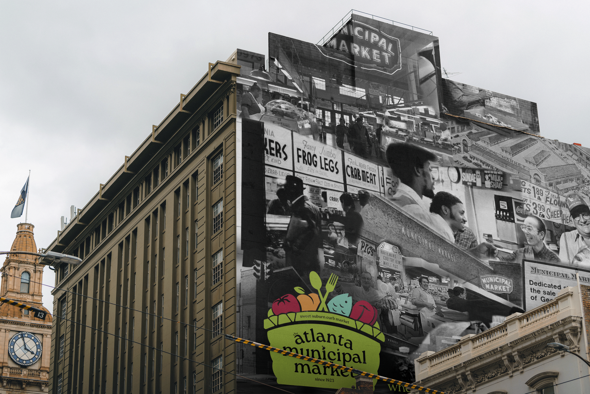
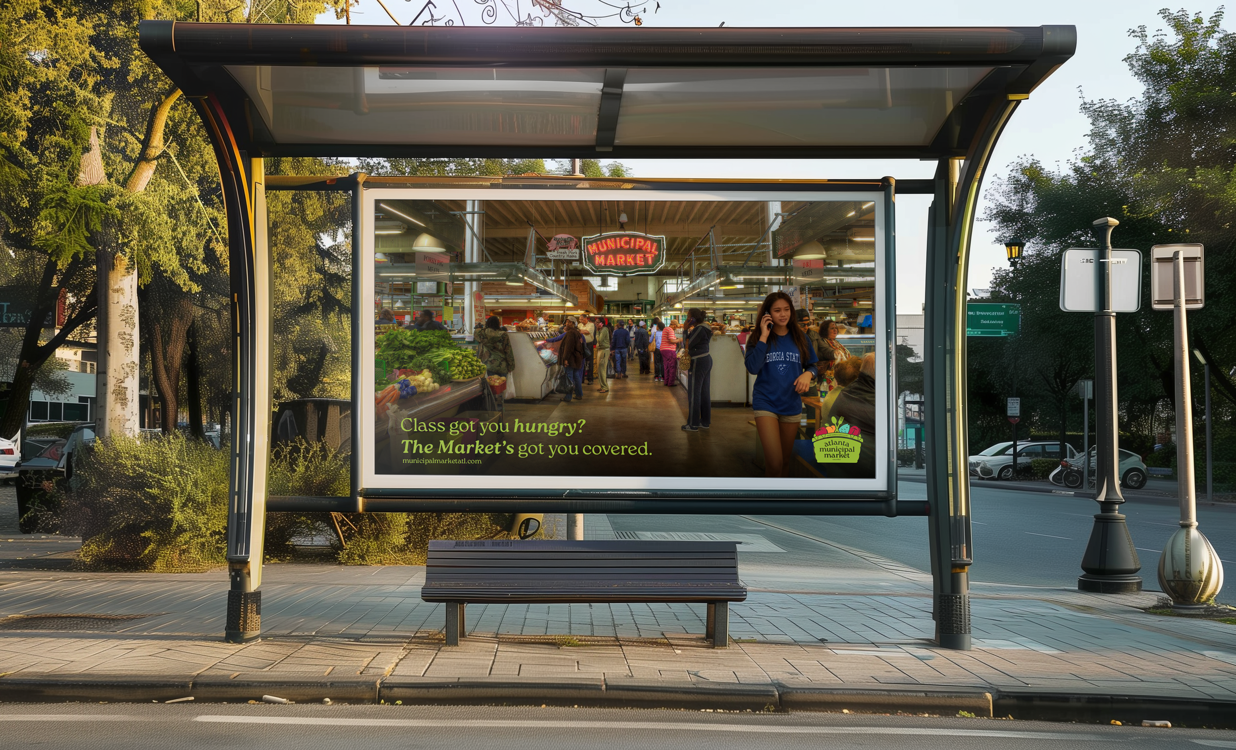
Historical photographs of the Market were paired with vibrant contemporary imagery, visually merging past and present within the same campaign. Archival images grounded the brand in its legacy, while modern photography highlighted fresh food, active vendors, and today’s community.
Together, the tagline and imagery created a cohesive narrative that positioned the Market as both historic landmark and living, evolving destination.